Check Out Felua.cc - I’d Love Your Feedback!

Bram

Well-known member
Licensed customer
Hi XenForo community!

I’ve recently launched Felua.cc, a Dutch community forum focused on gravel biking and fostering a strong sense of community among cycling enthusiasts. It’s been an exciting journey so far, but I know there’s always room to make things better.

I’d really appreciate it if you could take a moment to check out the site, explore the layout, and share your thoughts. Whether it’s feedback on the design, functionality, or overall experience, your critique and improvement tips would mean a lot.

Thanks so much for taking the time to help me improve Felua Cycling Club. I’m looking forward to hearing your feedback!

Ride on,
Bram 🚴‍♂️
 
Hello @Bram
thanks for sharing your forums with us!

I like the theme you choose for your forums. I think it matched perfectly!
At https://www.felua.cc/events/ you have to translate the phrases of the buttons at the top right cornor.
I like the way you use the Resource Manager for Route sharing! But I would change the default RM Icon for the widget.

1734539779036.webp

You can change the Icon into this for example. I think that fits better.

1734539846682.webp

Maybe you add Resource Categories for long Routes (100km+) Mid long Routes (50km+) and short Routes (10km+) or you can work with Resource prefix.

Greetings from Germany!
Timoo
 
Hi @Timoo thanks a lot for your feedback.

I have updated the icons and will translate the missing phrases soon as well.

The RM I keep it tidy and lean for now but over time when more gpx routes will be submitted I will definitely differentiate with extra subcategories.

Thanks for taking the time to check it out and post your thoughts, appreciate it!
 
Made some small updates. After running a successful forum for nearly 19 years (www.racedepartment.com) it's quite rewarding to start something really from scratch again with zero members. Loving the journey so far!
 
Hi @Bram excellent work! I love the simplicity in your forum and also the right color choice for light & dark mode, IMHO is a very important factor for the success of a site.

Also I noticed something very neat in your site that I think very few forums do. Your forum home points directly to a forum node, right? I suspect your HomePageURL option should be something like https://www.felua.cc/forums/some-node.123 so you must have only one forum node (even without a category) so all your forum threads come from that node and gives the impression that "you don't have categories or nodes" and only use prefixes to classify the threads (very much like Reddit does)

Am I correct? If yes, did you saw an increment of your traffic or usage since that layout change? I think that layout is very in tune with the current form of present the content. Many (young and not so young) people see the categories/forums layouts and then leave the site thinking it's too old (which it is)
 
Hello,

I have the domain cyclingforum.net. It is located in Wordpress.com. If you wish, I can give it to you as a gift? Please send me your e-mail address privately.
 
Also I noticed something very neat in your site that I think very few forums do. Your forum home points directly to a forum node, right? I suspect your HomePageURL option should be something like https://www.felua.cc/forums/some-node.123 so you must have only one forum node (even without a category) so all your forum threads come from that node and gives the impression that "you don't have categories or nodes" and only use prefixes to classify the threads (very much like Reddit does)
Correct, glad you like this approach. Especially for a fresh newly started community having everything central in one place is key imo.

I have seen too many forums fail in the past where there are thousands of subforums with too little users and content. With this approach I might loose a bit of SEO love for certain keywords in forum descriptions but I do like the increase in activity.

If it will stay like this for the long run I don't know :)
 
Last edited:
We’ve made some recent tweaks to the look and feel of our forum theme, some minor adjustments to the message layout and thread view for deskop users and we’ve also introduced a brand-new front page for our longer articles.

I’m personally quite happy with the result, but I’d love to hear what you think.
Are there any improvements, adjustments, or ideas that come to mind when you browse the site?

Your feedback will help us fine-tune the experience for everyone, so don’t hold back!

Check out www.felua.cc
 
Slowly building, slowly updating, slowly progressing. Exactly how I like it :)

Newest version of www.felua.cc went live this weekend. Next overhaul will include a reward system for contributing users. Can't wait for that.
 
1786830420799.webp

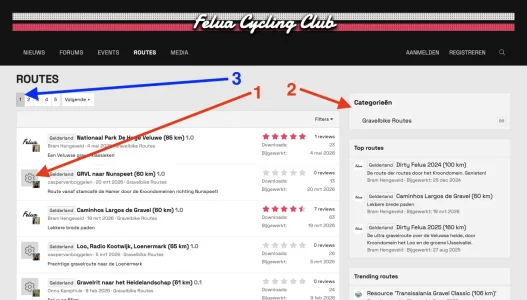
Hi @Bram

I really like the forum's current layout. Compared to before, it now has a much more distinct identity. In my opinion, the color scheme and the font harmonize particularly well.

There are a few small things I would personally tweak:

1. Default Resource Icon
Instead of the gear icon, I would use a Map Signs icon. I think that fits the theme better:

I found instructions here on how to change the default icon: https://xenforo.com/community/resources/customize-default-resource-manager-icon.8756/

2. Category Block
If there is only going to be a single category permanently, I would either remove the block or add other relevant categories. With just one category, the section currently feels a bit superfluous.

3. Button Width (optional)
I might make the buttons a bit wider. I think that would make them stand out better visually.

Otherwise, I think the direction you've taken is excellent. The forum now feels much more unique and, overall, very cohesive.
 
Thanks for your suggestions. Yeah the resource icons need to go. Honestly I find them pretty useless on all occassions. Still looking for a better way to present resources with cards or someting.

There will be more categories as the site grows, actually there is a second hidden one that is private at the moment. But you are right :)

Buttons are left default and look fine here, are they smaller than normal for you?
 
One final tweak to go as minimalistic as possible. Also included some in-house ads for clothing to not depend on google ads in the future.
 
Back
Top Bottom