There are a few problems with the breadcrumb as it is currently implemented.
First, the homepage is the root of the breadcrumb, which doesn't really make much sense. Home and Forums are already separate in the primary navbar, so when you drill down into the Forums and see the breadcrumb, the Forums homepage should be the root, not the Home link. This just logically makes sense from a navigation and usability standpoint, at least in my opinion.
Secondly, it seems like the breadcrumb is 'off' when browsing through forums and threads.
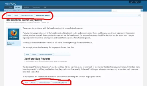
For example, when I'm browsing the bug reports forum, I see this:

The bolding of "General Discussions" and the fact that it is the last item in the breadcrumb to me implies that I'm browsing that forum, but in fact I am browsing one of it's children, the XenForo Bug Reports forum. I repeatedly find myself clicking on a breadcrumb item only to be taken back one more level than I expected.
In my opinion, the breadcrumb should look like this when browsing the XenForo Bug Reports forum:

i.e., the forum that you're currently browsing is the one that is bolded and the last item in the breadcrumb, not it's parent. This is how vBulletin does it:

Thoughts?
First, the homepage is the root of the breadcrumb, which doesn't really make much sense. Home and Forums are already separate in the primary navbar, so when you drill down into the Forums and see the breadcrumb, the Forums homepage should be the root, not the Home link. This just logically makes sense from a navigation and usability standpoint, at least in my opinion.
Secondly, it seems like the breadcrumb is 'off' when browsing through forums and threads.
For example, when I'm browsing the bug reports forum, I see this:
The bolding of "General Discussions" and the fact that it is the last item in the breadcrumb to me implies that I'm browsing that forum, but in fact I am browsing one of it's children, the XenForo Bug Reports forum. I repeatedly find myself clicking on a breadcrumb item only to be taken back one more level than I expected.
In my opinion, the breadcrumb should look like this when browsing the XenForo Bug Reports forum:
i.e., the forum that you're currently browsing is the one that is bolded and the last item in the breadcrumb, not it's parent. This is how vBulletin does it:
Thoughts?
Upvote
0
")