Avatar & member info (in thread) Is it creating too much white space beneath each post?

Is the Avatar/Member info leaving/creating too much white space beneath each post?

  • No, I want all the info, the white space doesn't bother me.

    Votes: 0 0.0%

  • Total voters
    3
  • Poll closed .

Halcyon

Member
There are two ways to view member info. Default & Kitchen.

  • In default mode - you click the avatar to see member info using the pop-out overlay*.
  • In kitchen sink mode - the data is already displayed down the left had side in list format.
So when you're in kitchen sink mode - Why click the avatar to display the pop-out overlay, if you can already view the data?

The kitchen sink method is currently flawed because it leaves too much dead space beneath the post. I know it's called kitchen sink mode to show everything, but it doesn't work in its current format.

I'd like both ways to view the member info integrated into one style. However, for this to work, I feel that the kitchen sink method, showing all the data, would work better if it could be collapsable (drop down box).Thus removing the white dead space and giving members two ways to view the same data. Having two choices is better, it gives the user greater freedom to navigate the page.

If its an either or situation, I'd like to know which one is prefered?

Please vote above.

I'm looking to buy this software, I'd like to know which 'member-info-access' feature will be used in the gold release 'default mode', both would be preferable!

I've added this poll to record responses, to hopefully assist the developers in making a considered choice.

Halcyon.
 
You can turn the member info off by choosing one of the other styles.

Click on the style name in the bottom left of the footer and choose Default or Fixed Width.
 
The Kitchen Sink style was created for demonstration purposes.

To give members an idea of what information can be included in the message template.
 
Thanks for the heads up Brogan, however, please add a vote, it's still a valid question. The stats don't lie (mostly). Its cool to get data, better now than later!

Agreed Ant... I'd like to see a drop down personally, if not the forum is difficult to read & thus the kitchen sink mode is not fit for purpose.

wink.png
 
The default and any style based on the default is fine. If admins add stuff to the postbit, then yes, there is too much white space. But I prefer to keep that info on the member page as the default style is designed to show.
 
I don't see the need for extra data to be added in the memberinfo though if I did then a expand/contract dropdown menu would be my preference. But ask yourself, it'll take one click to expand that data, what's the difference between clicking that expand option to see thae data expand when you can click the avatar and display the membercard?
 
I'm unsure why the kitchen sink is an option if it doesn't work effectively... why replicate the data in two locations, i.e. in thread showing all the data & with the pop-out feature. I'd like the kitchen sink mode to have a drop-down list if it's staying. It would improve that format. If the kitchen sink mode is to be removed (Brogan said it was for demonstration purposes) than I'm happy with the pop-out feature alone. Which do you prefer, we seem to have two choices, one that works & one that could be tweaked. Thats why I posted in the tweaks forum. :)

*Edit* - if you give people the choice, they will pick one. If the one they pick could be a bit better then... help develop it.
 
I'm not clear on what it is you're suggesting.

The site owner has the option to create styles as they wish.
Members then have the choice of using the style which they prefer.

There isn't really anything that can be done if the message template is so tall if all options are enabled.
As Shelley said, if they're going to be hidden in a collapsible container, then you may as well click the avatar and see the information in the overlay.
 
Like Shelley said if it's the same as the avatar click/membercard view then it's kinda useless. It has to be quicker and easier somehow to be considered and I can't see how.
 
I'm not clear on what it is you're suggesting.

The site owner has the option to create styles as they wish.
Members then have the choice of using the style which they prefer.

There isn't really anything that can be done if the message template is so tall if all options are enabled.
As Shelley said, if they're going to be hidden in a collapsible container, then you may as well click the avatar and see the information in the overlay.

I'm sure he's asking for some kind of expand/contract option to be included if that additional data is present within the memberinfo area. I could be mistaken.
 
I like both ways to view the member info, I'd just like to know which one is prefered? I'd like both to be honest, everyone likes a choice. If its the kitchen sink mode then I'd like it to be collapsible.

I'm looking to buy this software, I'd like to know which 'info-access' feature will be used in 'default mode', both would be good!
The only mode that ships is the default mode.

The kitchen sink mode does not ship as part of the software.
 
So you want the default behaviour/code to change, depending on the style in use?

Minimal information - clicking the avatar displays the overlay.
Maximum information - clicking the avatar does nothing.

The overlay contains additional information such as the status, and links to their profile page, profile page, follow, etc.

As Elizabeth said, there is only one default style.
 
Crikey, I'm dragging this out... thats the trouble when you don't have the answers... long winded questions.

Thanks Elizabeth, no kitchen sink... cool.

Brogan, I'd like two methods to view the members data.

In default mode, in the gold release, as well as the pop-out info overlay, I'd like to see some 'select' member info in the left hand column, at a quick glance. But not as much as in kitchen sink mode. Hence the poll.
 
In default mode, in the gold release, as well as the pop-out info overlay, I'd like to see some 'select' member info in the left hand column, at a quick glance. But not as much as in kitchen sink mode. Hence the poll.
Judging by previous comments from Kier/Mike, I don't think that's going to happen.

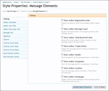
It is completely customisable in the ACP so it really doesn't matter how it ships.
You can add as much or as little as you want to your default style.

acp_message_elements.webp
 
Could always make a style with the extra user info on a horizontal row above the post like the legacy postbit on vb if I believe that's the correct one.
 
Judging by previous comments from Kier/Mike, I don't think that's going to happen..

Thats a shame, a glance to view location or occupation is quicker than clicking & waiting, then clicking to turn off to see someones basic data.

Looks like I'd need to get that modded for my purposes. Hmmm... it's all the little, simple things that need to be right for me. I don't like bloat. What's the new indicator (Outer) & (Inner)?

Thanks for your time & sticking with me during my waffle. It's exciting to see new forum software being developed, it's a shame (to a degree) it always needs to be bespoke
 
Thats a shame, a glance to view location or occupation is quicker than clicking & waiting, then clicking to turn off to see someones basic data.
Why is it a shame?
You can turn the location or occupation on if you wish on your style that you create for your forum.
I'm not quite understanding the problem.

I don't like bloat. What the new indicator (Outer) & (inner)?
That is customisable in the ACP, as are almost all of the individual elements which make up the style.

it's a shame (to a degree) it always needs to be bespoke
It would be impossible to please everyone, which is why the options exist in the ACP for each site owner.
 
Top Bottom