You are using an out of date browser. It may not display this or other websites correctly.
You should upgrade or use an alternative browser.
You should upgrade or use an alternative browser.
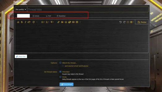
XF 2.0 Anyone have any idea where this can be changed?
- Thread starter Merlin07
- Start date
Merlin07
Active member
@Merlin07 Try this in your extra.less file and change the color to suit. You may need to change the text color too if it's obscured by the background.
Code:.inputGroup.inputGroup--joined .inputGroup-text { background: yellow !important; }
Unfortunately that did nothing. I don't understand because I didn't add those tabs and suddenly they appeared. Even still, I went through all the options one by one, refreshing a millions times to see what changed, and I didn't find anything. I would think that would be under the "Form" section or "Input" but nothing shows up. I'm tired of changing one small thing and suddenly 10 different things change that have nothing to do with it. Especially in the "Basic Colors" area. I change one thing and three other category colors change. It's very frustrating.
That specific area uses this CSS:
It essentially creates a gradient that transitions from the input background color to the content background color. If it's showing up like this, more than likely you're going to have other issues around the site. Rather than using CSS to fix specific things like this, I'd suggest going to Style properties -> Basic colors and making sure colors are properly set there first. I don't think you should be using a white input field (I'm assuming you are) on a dark background as an example. Tidy up that page first, make sure text colors don't match the backgrounds, example:
Accented content background color shouldn't be the same color as: Accented content text color (or even close, there needs to be contrast so the text can be seen)
After that, then you may need CSS adjustments if style properties don't exist.
It takes a bit to get used to it all and dark styles are especially more time consuming if not done properly from the start.
Code:
.inputTypes-input:checked + .inputTypes-display,
.inputTypes-display:hover
{
    color: @xf-inputTextColor;
    border-color:  @__borderColor;
    background: linear-gradient(180deg, @xf-inputBgColor, @__tabBackground);
}
It essentially creates a gradient that transitions from the input background color to the content background color. If it's showing up like this, more than likely you're going to have other issues around the site. Rather than using CSS to fix specific things like this, I'd suggest going to Style properties -> Basic colors and making sure colors are properly set there first. I don't think you should be using a white input field (I'm assuming you are) on a dark background as an example. Tidy up that page first, make sure text colors don't match the backgrounds, example:
Accented content background color shouldn't be the same color as: Accented content text color (or even close, there needs to be contrast so the text can be seen)
After that, then you may need CSS adjustments if style properties don't exist.
It takes a bit to get used to it all and dark styles are especially more time consuming if not done properly from the start.
Last edited:
Merlin07
Active member
ok, i have 2.2.15
Merlin07
Active member
That specific area uses this CSS:
Code:.inputTypes-input:checked + .inputTypes-display, .inputTypes-display:hover { color: @xf-inputTextColor; border-color: @__borderColor; background: linear-gradient(180deg, @xf-inputBgColor, @__tabBackground); }
It essentially creates a gradient that transitions from the input background color to the content background color. If it's showing up like this, more than likely you're going to have other issues around the site. Rather than using CSS to fix specific things like this, I'd suggest going to Style properties -> Basic colors and making sure colors are properly set there first. I don't think you should be using a white input field (I'm assuming you are) on a dark background as an example. Tidy up that page first, make sure text colors don't match the backgrounds, example:
Accented content background color shouldn't be the same color as: Accented content text color (or even close, there needs to be contrast so the text can be seen)
After that, then you may need CSS adjustments if style properties don't exist.
It takes a bit to get used to it all and dark styles are especially more time consuming if not done properly from the start.

that's the color scheme. Alright, I'll start from scratch again
Similar threads
- Question
- Replies
- 1
- Views
- 71


