
You are using an out of date browser. It may not display this or other websites correctly.
You should upgrade or use an alternative browser.
You should upgrade or use an alternative browser.
XF 2.1 Any chance to auto enlarge the font size on mobile views?
- Thread starter gogo
- Start date

Is it certain fields of text you want enlarged on a mobile device? I would think the easiest way would be through extra.less
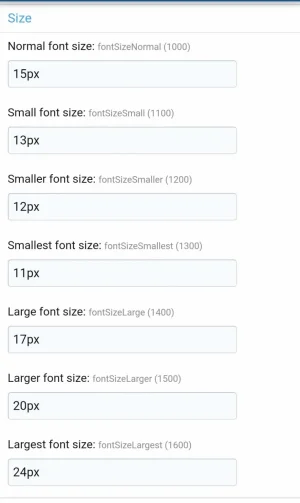

You can useHow do I refer to these font sizes in extra.less?
@xf- followed by the name of the property, for example @xf-fontSizeNormal.
It's not an element, it contains the value of the style property if you wanted to reference them in LESS. For example:
Saying that, for what you're looking to accomplish it may be better to use
Less:
html
{
    font-size: @xf-fontSizeNormal;
}
Saying that, for what you're looking to accomplish it may be better to use
rem font sizes in the style properties and then set your base font size on the html element accordingly (using media queries to make the base size larger on mobile). I haven't tested this approach though so YMMV.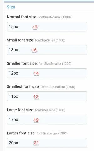
I'm suggesting setting the font sizes using something like this in
Then using
Normal font size:
Small font size:
Smaller font size:
Smallest font size:
Large font size:
Larger font size:
Largest font size:
You'd need to adjust the base values and style properties to your liking, they don't quite correspond with what you've listed above. I think this is your best bet for accomplishing this though.
extra.less:
Less:
html
{
    font-size: 16px;

    @media (max-width: @xf-responsiveNarrow)
    {
        font-size: 18px;
    }
}
Then using
rem units in the style properties. These units are proportional (multipliers) to the sizes set above:Normal font size:
1remSmall font size:
.875remSmaller font size:
.75remSmallest font size:
.625remLarge font size:
1.125remLarger font size:
1.25remLargest font size:
1.375remYou'd need to adjust the base values and style properties to your liking, they don't quite correspond with what you've listed above. I think this is your best bet for accomplishing this though.