R
ragtek
Guest
Many things changed since the first beta.
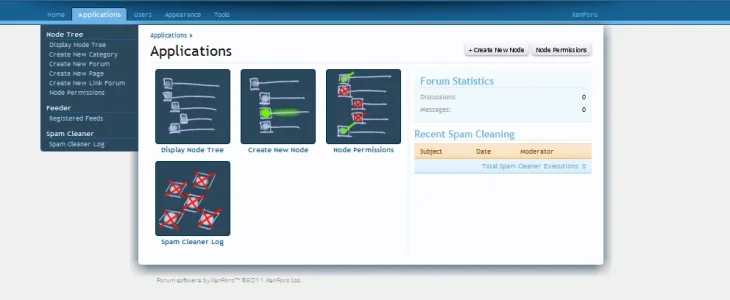
Now with many new menu entries, the acp looks IMHO strange. (IMHO it was strange since beta1, but now some other users also talked about it, so here's the suggestion .)
.)
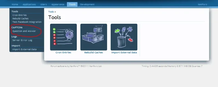
There is IMHO no "schema/logic" why some are only in the left menu, and some also have a image link.
(I hope you know what i mean , if not here's a pic: )
For example, you could also create a "image" for captcha".


Now with many new menu entries, the acp looks IMHO strange. (IMHO it was strange since beta1, but now some other users also talked about it, so here's the suggestion
There is IMHO no "schema/logic" why some are only in the left menu, and some also have a image link.
(I hope you know what i mean
For example, you could also create a "image" for captcha".


Upvote
0