Well, I say beta, because I haven't really had that much to do as i have moved the style over from S0rethumbs as that site is no more.
But yeah, it's an attempt at a somewhat different type of forum, from my last forum, me and a friend Rags have changed up the forums list and made some minor edits and added add-ons to the look and the message layout. Homepage needs some work still.
Anyway here is the link and screenshots below. Let me know what you think any ideas and criticism are welcome")
http://www.achievementsgaming.com/forums/
How my style started off to what it is now


Forum List Top

Forum List Bottom

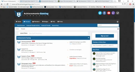
Homepage

Message Layout


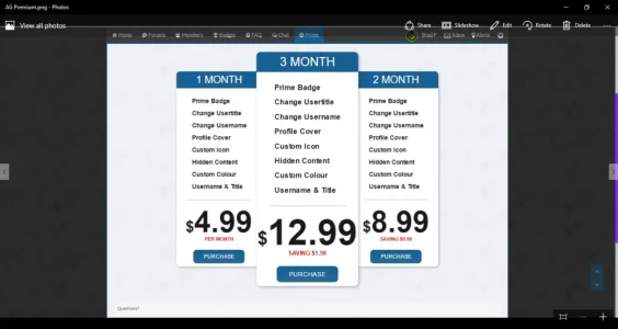
Premium Page

Chat

But yeah, it's an attempt at a somewhat different type of forum, from my last forum, me and a friend Rags have changed up the forums list and made some minor edits and added add-ons to the look and the message layout. Homepage needs some work still.
Anyway here is the link and screenshots below. Let me know what you think any ideas and criticism are welcome
http://www.achievementsgaming.com/forums/
How my style started off to what it is now
Forum List Top
Forum List Bottom
Homepage
Message Layout
Premium Page
Chat
Attachments
Last edited:


")


