GulfCity
Member
Hello everyone!
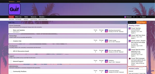
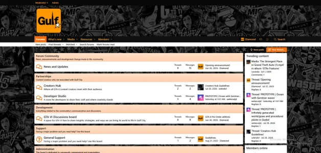
I'd like to share a project I've been working on over the past year called Gulf City. It's a community built for Grand Theft Auto VI, with the goal of bringing players together to discuss the game, share content, participate in events, and build lasting friendships as GTA VI continues to grow.
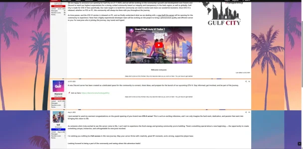
Alongside our Discord server, we've built a forum where members can discuss the latest news, post screenshots and media, write guides, showcase their creations, and take part in community discussions. My inspiration came from the classic gaming forums many of us enjoyed years ago, and I wanted to bring that experience back with a modern look and feel.
Main website link: https://gulfcity.gg (it comes with an external web page that takes you to the forums if you click on the button) - Don't mind the bugs in transitions between the pages; it will be fixed soon.
Forums direct link: https://forums.gulfcity.gg
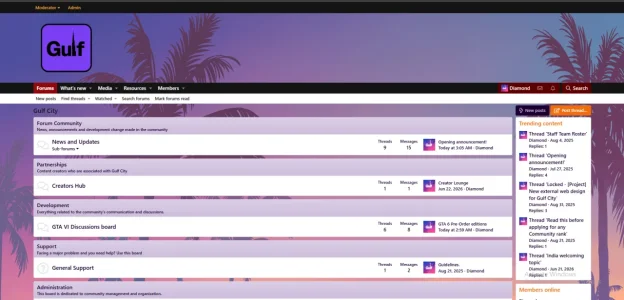
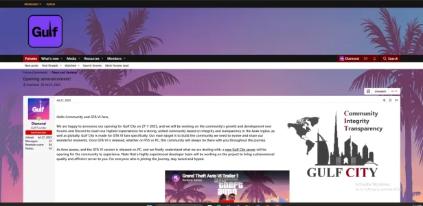
The project is still growing, and I'm constantly improving it based on community feedback. Every suggestion helps make Gulf City a better place for GTA VI fans.
I'd really appreciate your honest thoughts.
Thanks for taking the time to check it out. I look forward to hearing your feedback!
I'd like to share a project I've been working on over the past year called Gulf City. It's a community built for Grand Theft Auto VI, with the goal of bringing players together to discuss the game, share content, participate in events, and build lasting friendships as GTA VI continues to grow.
Alongside our Discord server, we've built a forum where members can discuss the latest news, post screenshots and media, write guides, showcase their creations, and take part in community discussions. My inspiration came from the classic gaming forums many of us enjoyed years ago, and I wanted to bring that experience back with a modern look and feel.
Main website link: https://gulfcity.gg (it comes with an external web page that takes you to the forums if you click on the button) - Don't mind the bugs in transitions between the pages; it will be fixed soon.
Forums direct link: https://forums.gulfcity.gg
The project is still growing, and I'm constantly improving it based on community feedback. Every suggestion helps make Gulf City a better place for GTA VI fans.
I'd really appreciate your honest thoughts.
- What do you think of the overall design?
- Does the forum feel inviting and easy to use?
- Is there anything you would add or change?
Thanks for taking the time to check it out. I look forward to hearing your feedback!