Grover
Well-known member
Although I do think it looks quite stylish the way it is now:
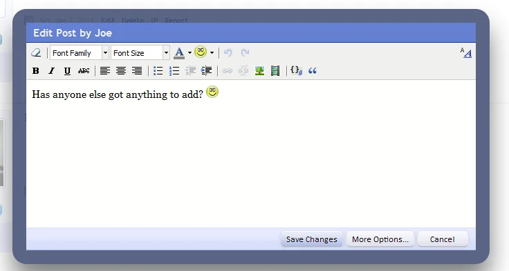
... when it comes to the usability (I have a bit the thought that my eyes now tend to give the big border too much attention, whereas the focus should be on the content, not the UI) , I would like to see this border reduced. I believe the border width of both the Member Card and Thread Previews for example would be a perfect fit. Like this:
-
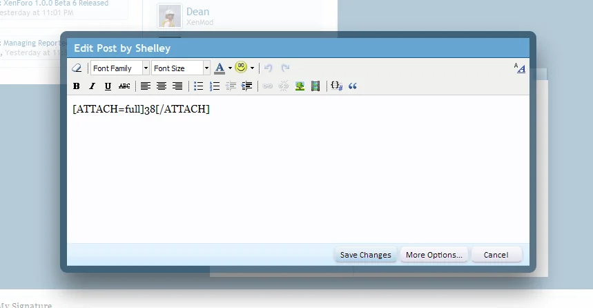
Less stylish, but I tend to believe it improves the functionality.
Images taken from this discussion: http://xenforo.com/community/threads/who-else-loves-pop-up-overlays.10592/
... when it comes to the usability (I have a bit the thought that my eyes now tend to give the big border too much attention, whereas the focus should be on the content, not the UI) , I would like to see this border reduced. I believe the border width of both the Member Card and Thread Previews for example would be a perfect fit. Like this:
-
Less stylish, but I tend to believe it improves the functionality.
Images taken from this discussion: http://xenforo.com/community/threads/who-else-loves-pop-up-overlays.10592/
Upvote
0


 .
.") .
.
") in the default XF install. The subtle change in the thread preview works wonders, so I was wondering if it would do the same for the Inline Edit Overlay.
in the default XF install. The subtle change in the thread preview works wonders, so I was wondering if it would do the same for the Inline Edit Overlay.