Lack of interest Reduce the border of the Inline Edit Overlay

This suggestion has been closed automatically because it did not receive enough votes over an extended period of time. If you wish to see this, please search for an open suggestion and, if you don't find any, post a new one.

Grover

Well-known member
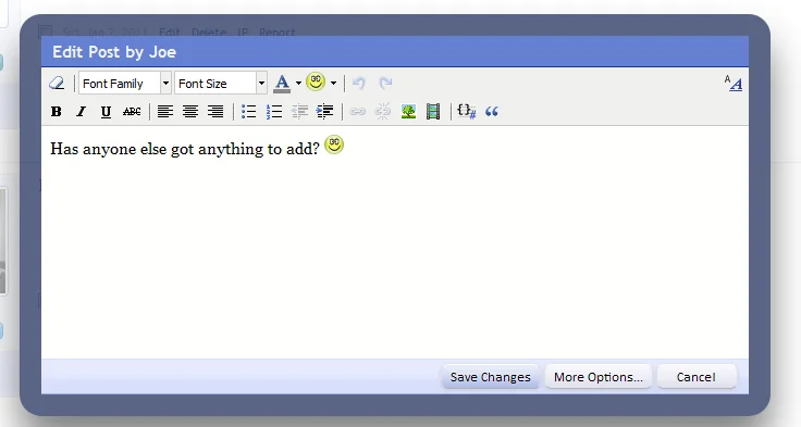
Although I do think it looks quite stylish the way it is now:
capture-png.9403


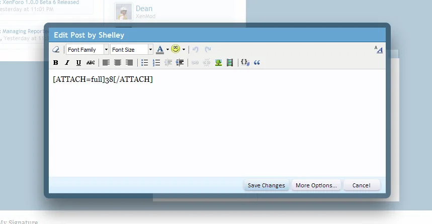
... when it comes to the usability (I have a bit the thought that my eyes now tend to give the big border too much attention, whereas the focus should be on the content, not the UI) , I would like to see this border reduced. I believe the border width of both the Member Card and Thread Previews for example would be a perfect fit. Like this:

inlineedit_overlay-png.9477


-
Less stylish, but I tend to believe it improves the functionality.

Images taken from this discussion: http://xenforo.com/community/threads/who-else-loves-pop-up-overlays.10592/
 
Upvote 0
This suggestion has been closed. Votes are no longer accepted.
The functionality doesn't change based on the border width :confused:

I guess it's me not having English as my mother language, because in Dutch you can refer to the 'functionaliteit' (functionality) in relation to the above. I guess the word in English in this case would be 'usability'? (which I actually already used in my text above, so I guess everybody understands what I wanted to say. Therefor your contribution to this customer request comes across as a little bit inane/unnecessary to me, but maybe you meant well?)
 
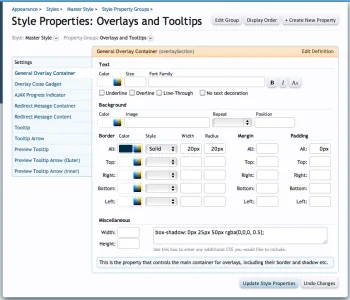
Anyone is free to alter the border width using the style property editor.

Screen shot 2011-01-17 at 17.25.44.webp

Personally, I like how it looks now, so I'm disinclined to alter the default. In fact, I think the wider border enhances the 'functionaliteit' by clearly separating the overlay from the background.
 
Although I do think it looks quite stylish the way it is now:


... when it comes to the usability (I have a bit the thought that my eyes now tend to give the big border too much attention, whereas the focus should be on the content, not the UI) , I would like to see this border reduced. I believe the border width of both the Member Card and Thread Previews for example would be a perfect fit. Like this:


-
Less stylish, but I tend to believe it improves the functionality.

Images taken from this discussion: http://xenforo.com/community/threads/who-else-loves-pop-up-overlays.10592/

Although I agree with you about the reduce border and radius for the inline edit overlay we tried some months ago experimenting with the border width on the thread previews and the thicker border allows you to focus on the thread preview content. I found and many others did too found that with a thinner border the eyes don't focus as much on the threadpreview.

I made the same suggestion as you did just now and on paper it sounds like it would work but the reality it doesn't once I made the necessary changes and put the proposal too the devs and community.

The edit inline overlay. I agree with 100% though the changes can easily be made and added in the extra.css template without the worry of having to revert templates.

The height of the inline editor is another story, I think this should be higher.
 
Anyone is free to alter the border width using the style property editor.

View attachment 9480

Personally, I like how it looks now, so I'm disinclined to alter the default. In fact, I think the wider border enhances the 'functionaliteit' by clearly separating the overlay from the background.

That would be good but does this alter all overlays? If so, imo not all overlays need the width narrowed down (as explained in my previous post) just the inline edit overlay which I'm not to fussed about as I can easily just make the changes in the extra css to alter that overlay alone and not the rest that reside elsewhere.
 
? I am not proposing a lesser border-width on the Thread Preview... I used the border of the Thread Preview as an example of a fitting width for the Inline Edit Overlay. I think the border of the Thread Previews are fine, it's just that with the much bigger Inline Edit Overlay I find the even bigger border a bit obtrusive. I am there to edit my text, not to be distracted by the UI that surrounds me in my workprocess.

In fact, I think the wider border enhances the 'functionaliteit' by clearly separating the overlay from the background.

Thanks for your constructive feedback (and glad you've learned some Dutch on the way to
wink.png
). I understand that the thickness of the border has also a positive side (separation-factor) now you've explained it. Obviously I don't know for sure how a thinner border would work in practice, so I am gonna to try it on my board (glad it is so easily changeable) and see how it works out with the separation-factor when I use a thinner border. I will be back...
smile.png
 
I've already increased the height of the editor window from 260px to 400px for the next release. It looks a lot less cramped.

Yes... the combination of the big border and the size indeed makes it look & feel a bit cramped. I am curious to find out how the big border with a bigger content height will look&feel... it might well be lesser obtrusive then.
 
? I am not proposing a lesser border-width on the Thread Preview... I used the border of the Thread Preview as an example of a fitting width for the Inline Edit Overlay. I think the border of the Thread Previews are fine, it's just that with the much bigger Inline Edit Overlay I find the even bigger border a bit obtrusive. I am there to edit my text, not to be distracted by the UI that surrounds me in my workprocess.

What are you proposing then? A 40px border set at a 300px radius?
 
Bytheway... I love this inline edit 'functionaliteit'! Makes it is so much more quick and convenient to edit your postings. I keep loving XenForo (it only get's better, doesn't it?), truly :cool:.
 
Would this thread be better off in Resolved/Implemented now then Grover?

Well...

Yes... the combination of the big border and the size indeed makes it look & feel a bit cramped. I am curious to find out how the big border with a bigger content height will look&feel... it might well be lesser obtrusive then.

... the changes made by Kier definitely makes the whole IEO more pleasurable (I really love this new UI feature) to use, as it looks & feels less cramped indeed. And subsequently the big border doesn't annoy me quite so much as it did in the beginning :).

If you want to move this thread, that's up to you. I still would like to see how it looks & feels on my own site (and preferably in XenForo by default) with the border reduced, because my eyes still tend to focus too much on the big border instead of the content (the reason of my suggestion, which still applies), but the current improvement makes it certainly a bit better workable already.
 
Personally, I like how it looks now, so I'm disinclined to alter the default. In fact, I think the wider border enhances the 'functionaliteit' by clearly separating the overlay from the background.

Kier, hello :)

As stated, I already think the enlarged size made it less cramped: nice. As you feel declined to alter the border-width -because of the benefits you mention concerning the separation from the background-, I was wondering if you might want to look at another approach. That is: changing the colour a bit instead of the width. I am inspired by this nice improvement: http://xenforo.com/community/thread...art-of-the-first-post.154/page-13#post-163903

Am I right in thinking that the border-colour of the edit-overlay has the same colour as the original colour of the thread previews? Seeing now what it can do to the UX when the colour on that was slightly changed, I was wondering if you could consider the same approach for the inline edit overlay.
 
Grover, what you are talking about is reducing the opacity of the @primaryDarker overlay border from the 0.65 currently used by all overlays to the 0.5 value used by the thread preview tooltip border.

That would look like this:

Screen shot 2011-02-18 at 15.25.09.webp

Is that more what you were looking for?
 
Is that more what you were looking for?

Yup :). I am aware I can change it myself in the Style Properties, so I will definitely try that when I get one of my two XenForo installs live, to see how it looks and feels in real practice. The reason why I brought it up as a suggestion is because I feel the heavy border is still a bit on the 'obtrusive side' ;) in the default XF install. The subtle change in the thread preview works wonders, so I was wondering if it would do the same for the Inline Edit Overlay.
 
Thanks for being able to test-drive it live right here :).

I am not quite sure myself (yet) what would be the best way to go. What do people think? Is this the preferred way (previous implementation):

inlineedit-png.9100


... or does this work better:

lighter box thread inline edit.webp
 
I prefer the darker border, it provides more definition.
The bottom one looks washed out.

Ultimately though it makes little difference, I'll just set it to how I want on my own site using Style Properties.
 
Top Bottom