You are using an out of date browser. It may not display this or other websites correctly.
You should upgrade or use an alternative browser.
You should upgrade or use an alternative browser.
Rant: I hate the Forum Home, it sucks.
- Thread starter Digital Doctor
- Start date
jmurrayhead
Well-known member
Not as visually appealing. Lacking the unique icons that also serve as visual indicators of the category. Crunched too close together, making it difficult to read.Might as well just do this then.
View attachment 58732
jmurrayhead
Well-known member
You have 10 minutes starting now....GO!That's just styling.
I could make the XenForo home page look like that in 10 minutes.
The information conveyed in both is the same though, i.e. zero.
I think the point is, the traditional forum home is...well...TRADITIONAL. It's outdated. There's so much irrelevant information displayed on IPB, XenForo, vBulletin and so on, that could really be done away with. NodeBB is different. That's not to say that it will work for everyone. The traditional forum home will still work for some people.
jmurrayhead
Well-known member
I like seeing the last post, last post time, number of threads, etc.
It provides more context on each forum as to how busy it is.
I've been finding that I don't use that information on forum home. I use recent posts for that information.
XenForo Admin CP is useless then, right? Wrong. The icons used are visual indicators that help me find what I'm looking for much faster than searching for the text.A link, even if it is styled as a block of colour, provides nothing other than a link.
Alien
Well-known member
I wouldn't mind seeing a mockup with a hybrid of both mind sets.
I think you can be more visually appealing while still displaying some of the last post stuff and icons in an attractive way.
The current way is a bit bland. The site shown recently isn't there yet either. It is very lacking without some hover-over effects on the box displaying some important information like counts, last post author, time stamps, icons, etc. I think there is a way to do this while maintaining a cleaner view.
I think there is some creative work to be done in this regard for designers to really do something new.
I might hire this out at some point for fun.
jmurrayhead
Well-known member
Indeed, that would be interesting.I wouldn't mind seeing a mockup with a hybrid of both mind sets.
Miner from MinerSkinz accomplished this quite nicely with his original Metro theme.I think you can be more visually appealing while still displaying some of the last post stuff and icons in an attractive way.
I don't think that stuff is that important for a forum home (like I mentioned earlier, recent posts has all that information), however, as I mentioned above, it can be done quite elegantly.The current way is a bit bland. The site shown recently isn't there yet either. It is very lacking without some hover-over effects on the box displaying some important information like counts, last post author, time stamps, icons, etc. I think there is a way to do this while maintaining a cleaner view.
I agreeI think there is some creative work to be done in this regard for designers to really do something new.
")
Adam Howard
Well-known member
I'm going to attempt to speak for the silent majority.... The forum index page WORKS!
Look, the index on every forum software hasn't changed because developers lack an imagination. It hasn't changed because it works and it is what people have come to expect from forums.
I've not see any forum development with a different index, attract a large range of large communities. If you want the index changed, you should contact a designer.
Now a portal would be a game changer and I would love to see a XenForo Portal / CMS. And of course that would become the root index, but the forum index should be kept overall "as is"
Look, the index on every forum software hasn't changed because developers lack an imagination.
It hasn't changed because it works and it is what people have come to expect from forums. I've not see any forum development with a different index, attract a large range of large communities. If you want the index changed, you should contact a designer.
Now a portal would be a game changer and I would love to see a XenForo Portal / CMS. And of course that would become the root index, but the forum index should be kept overall "as is"
jmurrayhead
Well-known member
A lot of things in this world WORK, Adam. It doesn't make them the only way or the right way. A perfect example of this are people in the office that use Excel as a "database". It works...but it could be much better.I'm going to attempt to speak for the silent majority.... The forum index page WORKS!
Look, the index on every forum software hasn't changed because developers lack an imagination.
I've not see any forum development with a different index, attract a large range of large communities. If you want the index changed, you should contact a designer.
Now a portal would be a game changer and I would love to see a XenForo Portal / CMS. And of course that would become the root index, but the forum index should be kept overall "as is"
A nice thing about nodeBB is that it DOESN'T look like a forum on the home page. It's lacking the hideous navigation menu that just about every other forum software has. Finding things on NodeBB is so simple. It's a refreshing change.
But arguing all these things doesn't really make sense. Different people - different tastes. Having more options is a good thing.
Adam Howard
Well-known member
I'll agree on that. And having seen NodeBB, I kind of like the forum index, but they seem to have gone a different route when it comes to threads and post, which I don't think looks anything like a forum.A lot of things in this world WORK, Adam. It doesn't make them the only way or the right way. A perfect example of this are people in the office that use Excel as a "database". It works...but it could be much better.
A nice thing about nodeBB is that it DOESN'T look like a forum on the home page. It's lacking the hideous navigation menu that just about every other forum software has. Finding things on NodeBB is so simple. It's a refreshing change.
But arguing all these things doesn't really make sense. Different people - different tastes. Having more options is a good thing.
jmurrayhead
Well-known member
What is it that gives you that impression?I'll agree on that. And having seen NodeBB, I kind of like the forum index, but they seem to have gone a different route when it comes to threads and post, which I don't think looks anything like a forum.
Adam Howard
Well-known member
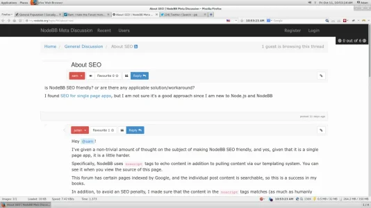
This is what they show on
https://github.com/designcreateplay/NodeBB/

^^^ However, this is not how it seems to be on their working demo. Their replies seem to be pushed to the right. And for course the thread index has that forever auto scroll function, but most importantly does not detail if anything has been replied to.
https://github.com/designcreateplay/NodeBB/
^^^ However, this is not how it seems to be on their working demo. Their replies seem to be pushed to the right. And for course the thread index has that forever auto scroll function, but most importantly does not detail if anything has been replied to.
jmurrayhead
Well-known member
What you see in that image is exactly what I see on the demo. The replies ARE pushed to the right in both. Not too sure how I feel about auto scroll. It's convenient in that it doesn't require me to click somewhere to go to a new page. Just wondering how it's handled for search engines.This is what they show on
https://github.com/designcreateplay/NodeBB/
^^^ However, this is not how it seems to be on their working demo. Their replies seem to be pushed to the right. And for course the thread index has that forever auto scroll function, but most importantly does not detail if anything has been replied to.
Adam Howard
Well-known member
not what I see... see screen shotWhat you see in that image is exactly what I see on the demo. The replies ARE pushed to the right in both. Not too sure how I feel about auto scroll. It's convenient in that it doesn't require me to click somewhere to go to a new page. Just wondering how it's handled for search engines.
Attachments
Alien
Well-known member
I could see clever overlay/layering or hover-over effects to fit icons necessary, last post info, all sorts of things in my MIND but I am not a mockup artist and can't convey it unfortunately... In my head, a site with 15 forums would scroll very little to get all information across. Definitely much less than in the typical forum home fashion.
I don't want tons of wasted space, but that grid can be enhanced dramatically with much more useful information.
I don't want tons of wasted space, but that grid can be enhanced dramatically with much more useful information.
jmurrayhead
Well-known member
I noticed that your screen shot doesn't show the avatars that are on the left side of each post.not what I see... see screen shot
Shelley
Well-known member
I could see clever hover-over effects to fit icons necessary, last post info, all sorts of things in my MIND but I am not a mockup artist and can't convey it unfortunately... In my head, a site with 15 forums would scroll very little to get all information across. Definitely much less than in the typical forum home fashion.
I don't want tons of wasted space, but that grid can be enhanced dramatically with much more useful information.
I can certainly see good ways to inject a nice layout and still keep key info in. I think DD (no offense) posted a poor example of a layout. I'm surprised people fell for that pile of horsepile with extra helping of flies since the forum stats for starters is atleast 10 years old. Infact, 10 year old horizontal statistic layouts didn't waste this much space that this example wastes, it's beyond fugly.
That being said. Xenforo for forumhome stuff have imo have minimised forumhome bloat and kept in key information whilst still keeping a great, practical forumhome layout. It's why whenever I style I rarely deviate from the default layout because it utilises spaces and elements laid out in a efficient, practical way.