No obvious way to access "Your Account"

Paul B

XenForo moderator
Staff member
Due to the recent changes, there is now no obvious way to access "Your Account".

I know that all I have to do is hover over my username and click one of the options in the menu and it will take me to that part of my account.
However, new members and those less savvy might get confused by this.

Is it worth just putting a "Your Account" link at the top of the drop down menu, just underneath "Sign out" for example?
 
...and I also agree with Grover that having 3 links to the Profile-Page but no link to the Settings-page is not perfect.

I also agree with Grover,

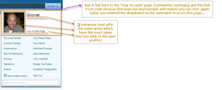
Talking about duplicate links Kier, at this moment we have 3 links to the User's Profile in the UDM (User Dropdown Menu):

* Clicking on my Avatar (*) bring me to my Profile,
* Clicking on my Username bring me to my Profile,
* and... Clicking on the newly introduced 'Your Profile Page', bring me to my Profile.

It doesn't bother me, but just to show that duplicate links don't have to be an issue/reason not to include an obviously named 'Your Account' link for people who think (like me) this would be better/an improvement.

(*) I thought this used to be a way to change your own avatar?

A picture says more then...

UDM redundancy.webp

My remarks:

- Why have 3 the exact same links in this little same area? (It is not a problem actually, because I do feel the new 'Your Profile Page' can make it clearer for some people). The question is... why provide 3 of them and not...
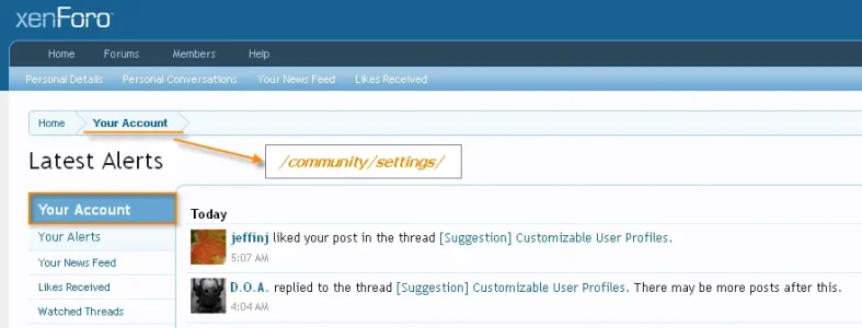
- Why not include a link 'Your account' as well (the link is already provided, but it is too hidden behind the upper username there). For the same reasons... for some people it will just be clearer to have a direct link to 'Your Account' (community/settings). The 'Your Account'-link is already used in the breadcrumb isn't it?:

your account link.webp

.... So a direct link to that from the UDM wouldn't be so unlogical, IMHO.
 
Also, why "Avatar" is so far from the avatar? :)

Edit: If it would be under the avatar, then why not use the avatar itself? But it was like that already... Never mind. :confused:
 
The template system allows anything and everything.

On the other hand, I'm not sure how a menu that is labelled with your own name could be less intuitive than the cryptic 'User CP' text that was used in vBulletin 3.
On every vBulletin forum I've administrated, I've renamed the phrase to "Settings". ;)
 
On every vBulletin forum I've administrated, I've renamed the phrase to "Settings". ;)
I'm not sure that actually describes the usercp.php page either though.

Indeed... XF is already so much better then vBulletin ever was when it comes to the setup of the menus. Just take a look at our once beloved vB:

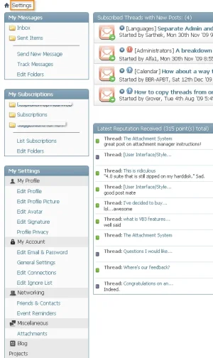
- What does the PM system do in the Settings?! (XF has them in 'Your Account (which is far better name compared to 'Settings') and XF provides a dedicated link of the Inbox on the menu bar... which has the benefit of splitting 'notifications/alerts' of new PC's from the other Alerts ---> great thinking!)
- Arguably Thread Subscriptions also have not much to do with 'Settings', do they?

vb settings.webp

Bottom line is that 'Your Account' (XF) is much more fitting then 'Settings' (vB). Settings are a part of Your Account in XF, whereas on vB everything is put under 'Settings'.
 
I've never been able to concoct a 2-3 word analogy for "My Settings, Private Messages, Profile, Subscribed Threads, Comment Wall, Avatar, Alerts, and Trophies" but "Settings" is something that people will try pretty quickly after deciding they need to change or track something on their account. "My Account" works well too.

UI and trying to think like a user is a favorite hobby of mine.
 
I've never been able to concoct a 2-3 word analogy for "My Settings, Private Messages, Profile, Subscribed Threads, Comment Wall, Avatar, Alerts, and Trophies" but "Settings" is something that people will try pretty quickly after deciding they need to change or track something on their account.

UI and trying to think like a user is a favorite hobby of mine.

You've already mentioned the phrase yourself in your explanation. 'Their account', indeed. Guess what phrase XF offer us by default?

UI and trying to think like a user is more then a favorite hobby of mine. ;)

Edit: I see you've added "My Account" works well too. to your posting now. I guess we share the same hobby. :)
 
Yes, like Kier is saying I also thought before that 'settings' in not quite the correct phrase for this URL. Because it doesn't bring you to your settings... it brings you to Your Account, which encompasses more then just your settings...

See:
your-account-png.1180

This has now been implemented. Great! :cool:
 
Top Bottom