You are using an out of date browser. It may not display this or other websites correctly.
You should upgrade or use an alternative browser.
You should upgrade or use an alternative browser.
Nice new footer!
- Thread starter Onimua
- Start date
Grover
Well-known member
The new forum footer only really works for long pages, like the ones you'd see when browsing a forum. The main site has deliberately short pages with all information readily accessible at all times, so there is no need for the 'mega footer'.
Changed your mind huh?
")
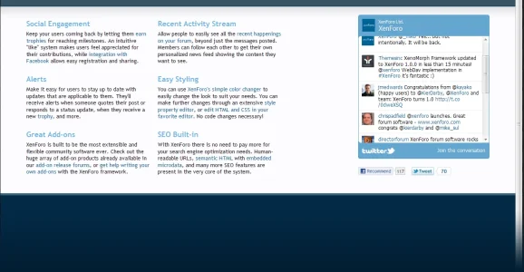
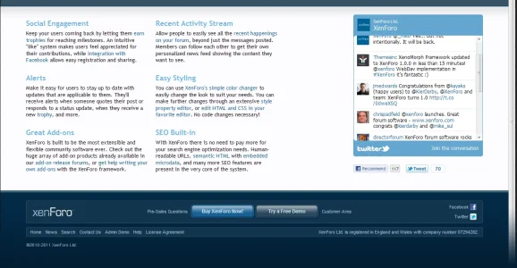
Mock up
... has become 'Show up'.
I had to lengthen the home page and various other changes to make it fit, but I think it works now.Changed your mind huh?
Not only do I like it a lot, but I wish it was on the main Xenforo page as I'd be more inclined to buy the software.

Mitchell
Member
Well look at that
looks so much better now. Once I'm paid, I'm now gonna have to put my money where my mouth is, which is fine by me.dutchbb
Well-known member
I never expected that. Imho that home page was clean, professional, simple, in balance. It already had a 'Buy' and 'Demo' button. It looked 'KISS' instead of crowded.
Having said that, that large footer could work on some pages, but the home page? Looks much better without it imo. Anyway, removed with personal css and done.
Having said that, that large footer could work on some pages, but the home page? Looks much better without it imo. Anyway, removed with personal css and done.
Shelley
Well-known member
I had to lengthen the home page and various other changes to make it fit, but I think it works now.
It's looking nice. The only two things I'd like to see (preference based) is the margin reduced maybe set to 90% and the gradient removed. Either way I'm liking the footer regardless.
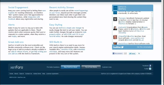
Xenforo home page using a gradient #011e32 (seen on screenshot xenforo_homepage1.png)
Attachments
Peggy
in memoriam 2016
I really like what you did with the homepage footer. I don't think it looks crowded at all, and the gradient in the footer is very attractive.I had to lengthen the home page and various other changes to make it fit, but I think it works now.
AnthonyCea
Well-known member
That looks good Kier, better than I thought it would on the homepage, it looks better there than it does on the forum.
Grover
Well-known member
I never expected that. Imho that home page was clean, professional, simple, in balance. It already had a 'Buy' and 'Demo' button. It looked 'KISS' instead of crowded.
Having said that, that large footer could work on some pages, but the home page? Looks much better without it imo. Anyway, removed with personal css and done.
If this new footer on the home was/is meant to generated attraction to it, then it surely succeeds 200% indeed
. I do like the idea of a professional footer (whatever that may mean), but I agree with you that now on the frontpage it indeeds looks rather crowded doesn't? If you're using a big enough horizontal resolution on your PC it simply can not be missed, since your focus is immediately drawn to it. And I guess this is exactly the purpose. Thus... making it 200% successful in it's goal ") .
.Yup, it doesn't look quite that clean/simple/balanced/sophisticated anymore, I agree. And why 2 instances of big [Buy] and [Demo] buttons indeed. Having said all that... this is a screen (mostly) aimed at new potential XenForo clients isn't it. So, if people (apparently) feel more inclined/stimulated to buy the product this way, then by all means it's a good thing. And it's not part of the forum software itself (which we buy and need to use) anyway, so I guess let the company make the decision that they feel is best for them...
Grover
Well-known member
You should use the header on the Help pages (including the drop shadow) for all of pages on the site, IMO. It looks really professional and would really contribute to a unified, professional-looking site design.
I totally love this dropshadow effect. It's also used inside the ACP you know: http://www.fractalizer.ru/frpost_554/xenforo-1-0-beta-admin-control-panel-in-pictures/.
Not sure how it would look/if it has a place on the forum home, but I would sure like to see a mockup of it
 .
.dutchbb
Well-known member
Happy to see at least some nuance hereIf this new footer on the home was/is meant to generated attraction to it, then it surely succeeds 200% indeed
Yup, it doesn't look quite that clean/simple/balanced/sophisticated anymore, I agree. And why 2 instances of big [Buy] and [Demo] buttons indeed. Having said all that... this is a screen (mostly) aimed at new potential XenForo clients isn't it. So, if people (apparently) feel more inclined/stimulated to buy the product this way, then by all means it's a good thing. And it's not part of the forum software itself (which we buy and need to use) anyway, so I guess let the company make the decision that they feel is best for them...
 Yes that's the problem, the footer draws attention to it, while the header already contains all the buttons new customers need...
I loved that big header with the clear buttons when I first saw it, it was an invitation to buy. Now the footer draws some of that attention away from the header, for no good reason at all. But I believe there's a very simple solution for this: show a simple/small footer on the home page, keep the big footer for every other page. Win-win. But it's their decision to make, we can only suggest.
DoctorWatsOn
Well-known member
This thread mirrors so many others on here.
It's impossible to please all of the people all of the time
Not sure about that.
If you handed over a million pounds to everyone, I very much doubt you'll hear a single person complain.

I'd be willing to bet your million pounds they wouldIf you handed over a million pounds to everyone, I very much doubt you'll hear a single person complain.
DoctorWatsOn
Well-known member
I'd be willing to bet your million pounds they would
OK, I'll take up that bet, if you would like to start handing out the cash to everyone............
Similar threads
- Replies
- 4
- Views
- 365
- Question
- Replies
- 1
- Views
- 404
- Question
- Replies
- 0
- Views
- 294
- Replies
- 1
- Views
- 258
- Question
- Replies
- 25
- Views
- 1K