You are using an out of date browser. It may not display this or other websites correctly.
You should upgrade or use an alternative browser.
You should upgrade or use an alternative browser.
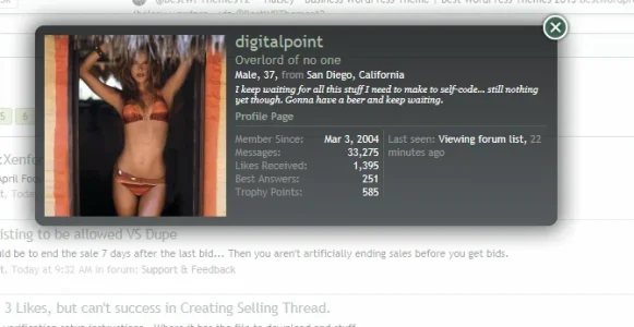
Not planned member card redesigned
- Thread starter Nasr
- Start date
This suggestion has been closed. Votes are no longer accepted.
Shelley
Well-known member
I, personally, like the simplicity of XF. Excluding those that absolutely need them, I find more than a few addons makes a forum look trashy and cheap, like MySpace of 10 years ago.
I think when it's all said and done some folks would be looking for a hi definition membercard with the unnecessary redundant garbage they throw in there. That may have worked in 1999.
I already had a modified member card on my site but I really like the two column layout so I stole copied it.
We don't have any add-ons installed which hook into it so it's not an issue (at the moment).
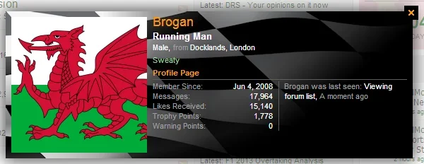
If more vertical space is ever needed then I can swap the columns around and make the stats column use the full height.
We don't have any add-ons installed which hook into it so it's not an issue (at the moment).

If more vertical space is ever needed then I can swap the columns around and make the stats column use the full height.
Shelley
Well-known member
I already had a modified member card on my site but I really like the two column layout so Istolecopied it.
We don't have any add-ons installed which hook into it so it's not an issue (at the moment).
View attachment 43501
If more vertical space is ever needed then I can swap the columns around and make the stats column use the full height.
This is what is worrying me. If your liking the layout chances are it will be included in an update with no option for others to have the original layout. Not arguing with you here just pressing my point which is very valid. Allow the option for those of us that don't want the wasted latest activity space present to have an option of not using the gimmicky layout.
I can't be more forward than that without beating about the bush. There's zero issues with the current layout, there's no need to change it unless the option is available for others to use the layout which currently is.
My opinion of it will have no bearing on whether it is adopted for a future build.If your liking the layout chances are it will be included in an update with no option for others to have the original layout.
I have changed it for my site using EXTRA.css, that is all.
Shelley
Well-known member
My opinion of it will have no bearing on whether it is adopted for a future build.
I have changed it for my site using EXTRA.css, that is all.
I haven't looked into how to do the layout proposal. (at a glance) I thought it required a template edit but then i never fully explored the css solution since it's a structure i would never use. If it's that easy I see no reason why it can't be posted up in the rm as an enhancement where members can do this layout change if they're so inclined to do so and simply leave the membercard alone as it's perfectly fine the way it is.
Apologies if i'm coming accross as an ass Paul that is not the intention. I think the membercard is great the way it is so pressing my point more than i would like.
erich37
Well-known member
Suggestion: Just checkout all that wasted space, the shadow is using is way way too much. Think outside the box and utilize the space.
hey.... "think out of the VBox" .....is my slogan
erich37
Well-known member
BTW:
speaking of "Membercards", there is still a "Privacy bug/issue" regarding Membercards which IMHO should be fixed in XF-core:
http://xenforo.com/community/threads/member-card-privacy.40063/
http://xenforo.com/community/threads/membercard-privacy-issue.47772/

speaking of "Membercards", there is still a "Privacy bug/issue" regarding Membercards which IMHO should be fixed in XF-core:
http://xenforo.com/community/threads/member-card-privacy.40063/
http://xenforo.com/community/threads/membercard-privacy-issue.47772/
EQnoble
Well-known member
Since it is pretty much a styling thing and styling a single element is pretty minor ...I don't care either way.
The two column layout is nice and so is the default...and pending your forum's look...pretty much anything can work for the member card area...it really is in the eye of the beholder and I don't see everyone agreeing to the same thing here. As far as the two column goes , it looks professional and if your community attributes importance to stats...the two column layout makes them much easier to scan though for sure.
If you have more of a leisure type of board that runs no addons which attach data to the member card on the other hand the two column does nothing for you unless you just like it. I do see one thing with the two column that could be improved upon but realistically I will just wait and see what happens....if it changes to the two column I will apply my idea to the two column MC.
What ever happens here I can agree with simply because it is a styling issue and most people change up the default style to suit their forum. If a new layout doesn't work for me I will just change it as I have everything else that I wanted to. It is just html and css...if it was actual programming stuff I would be more concerned as it would be harder to change things up but this is pretty straight forward to customize as it is.
Again, as long as the suggestions don't get all crazy, I really don't have a problem with any of them...just puttin my 2c in here.
As per my first post, without a new approach to the member card I don't think this will be implemented as too many add-ons hooking into it will overflow out of the bottom of the card.
I have made a slight change to the CSS for mine, moving the last activity text to a new line.
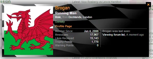
All done in EXTRA.css so no template edits required
I have made a slight change to the CSS for mine, moving the last activity text to a new line.

All done in EXTRA.css so no template edits required
Shelley
Well-known member
As per my first post, without a new approach to the member card I don't think this will be implemented as too many add-ons hooking into it will overflow out of the bottom of the card.
I have made a slight change to the CSS for mine, moving the last activity text to a new line.
View attachment 43524
All done in EXTRA.css so no template edits required
So the latest is we won't be seeing the sidebar, subforum dropdown menu integrated into the membercard? Shame.
Shelley
Well-known member
Huh?

Just an idea I had. Cram a forum within a membercard but I think "More space is required". It's gimmicky but hell if i don't throw a crazy idea on the table that gets you thinking.
Shelley
Well-known member
I should be able to do that using an iframe...
iwant.
Lisa
Well-known member
*shudders* I'm feeling all 1999!I should be able to do that using an iframe...
Similar threads
- Replies
- 5
- Views
- 514
- Replies
- 11
- Views
- 443
- Replies
- 10
- Views
- 1K
- Replies
- 1
- Views
- 94
- Replies
- 165
- Views
- 7K

