You are using an out of date browser. It may not display this or other websites correctly.
You should upgrade or use an alternative browser.
You should upgrade or use an alternative browser.
Flexile 1.1.5.1
No permission to download
- Thread starter Erik
- Start date
- Status
- Not open for further replies.
Digital Doctor
Well-known member
I think I may add support for all of Jaxel's modifications in the next release of Flexile, seeing as they are very popular. Although ideally I should find a way to deal with the CSS in such a way that the custom CSS shouldn't be required.
Here are the current constructs:
Jaxel: Would alot of issues be averted if you told people in the initial post of your Mod threads
[8WayRun.Com] XenPorta (Portal)
[8WayRun.Com] XenCarta (Wiki)
[8WayRun.Com] XenMedio (Media)
[8WayRun.Com] XenAtendo (Events)
[8WayRun.Com] XenTorneo (Tournaments)
[8WayRun.Com] XenGrado (Ladder)
Your plugins are optimized in Flexile.
For newbie users like me, I'd like to know which Style is going to give me the least headaches. Others might not mind using their preferred style. But would Addon users benefit (right from the beginning) from knowing about Flexile ?
Maybe you can make a new thread [8WayRun.Com] Optimized Styles for my Addons.
And you could discuss which styles work best, and all style related issues. You can explain what you like about Flexile ... etc. I am already seeing Styles being discussed in one of your threads, and the questions have already been answered in another thread !
Maybe this is not necessary ?
Something to think about.
Jaxel
Well-known member
The style issues have NOTHING to do with my mods... therefore I wish to keep them out of my threads. The limitations on Flexile are due the nature of how it removes the content box from around pages that have sidebars. It makes the skin look a TON better, but XenForo wasn't originally designed for this purpose... so each exception must be programmed in manually. If I had to list in my mod threads each and every exception for each and every custom skin... I wouldn't have time to program.Jaxel: Would alot of issues be averted if you told people in the initial post of your Mod threads
Your plugins are optimized in Flexile.
For newbie users like me, I'd like to know which Style is going to give me the least headaches. Others might not mind using their preferred style. But would Addon users benefit (right from the beginning) from knowing about Flexile ?
Maybe you can make a new thread [8WayRun.Com] Optimized Styles for my Addons.
And you could discuss which styles work best, and all style related issues. You can explain what you like about Flexile ... etc. I am already seeing Styles being discussed in one of your threads, and the questions have already been answered in another thread !
Maybe this is not necessary ?
Something to think about.
I don't have to optimize my mods for Flexile... in fact, I CAN'T. Its impossible, because you know why? XENFORO isn't optimized for Flexile. As I said before, the fault is completely on the skin... which looks awesome. Erik has to manually add exceptions for XenForo to get it to look right... he shouldn't be asked to manually add exceptions for custom mods... and neither should I.
Although, it would be nice if Erik could find a way to work around the need for manual exceptions, I doubt its possible right now... unless of course Kier and Mike programmed in specific ID tags for pages with sidebars.
Digital Doctor
Well-known member
Thanks for the explanation.
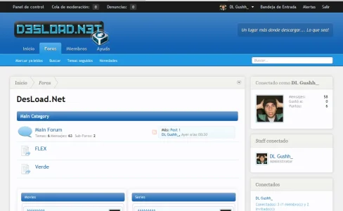
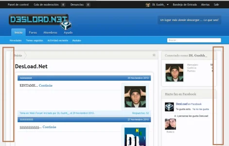
Can someone show me an example/screengrab of this feature of Flexile ?
I can't understand the benefits of removing the content box around pages with sidebars.
The limitations on Flexile are due the nature of how it removes the content box from around pages that have sidebars. It makes the skin look a TON better, but XenForo wasn't originally designed for this purpose.
Can someone show me an example/screengrab of this feature of Flexile ?
I can't understand the benefits of removing the content box around pages with sidebars.
Jaxel
Well-known member
Looking through the code... I dont see an easy way to make it "automatic"... but I do see a way to make it EASIER to manually add exceptions...Although ideally I should find a way to deal with the CSS in such a way that the custom CSS shouldn't be required.
This is the default code for .breadBoxBottom in "breadcrumb.css":
Code:
.forum_list .breadBoxBottom,
.news_feed_page_global .breadBoxBottom,
.member_list .breadBoxBottom,
.online_list .breadBoxBottom,
.conversation_view .breadBoxBottom,
.report_view .breadBoxBottom {
    border: 1px solid @lightMonochrome;
    border-radius: 6px;
    box-shadow: 0 0 12px rgba(0,0,0,.1);
    margin: 0;
    padding: 0;
}
Why don't you change this to:
Code:
<xen:include template="flexile_breadBoxBottom.css" /> {
    border: 1px solid @lightMonochrome;
    border-radius: 6px;
    box-shadow: 0 0 12px rgba(0,0,0,.1);
    margin: 0;
    padding: 0;
}
And then create a template called "flexile_breadBoxBottom.css" with:
Code:
.EWRcarta_PageArchive .breadBoxBottom,
.EWRcarta_PageView .breadBoxBottom,
.EWRmedio_Categories .breadBoxBottom,
.EWRmedio_CategoryView .breadBoxBottom,
.EWRmedio_KeywordView .breadBoxBottom,
.EWRmedio_Media .breadBoxBottom,
.EWRmedio_MediaView .breadBoxBottom,
.EWRmedio_Playlists .breadBoxBottom,
.EWRmedio_PlaylistView .breadBoxBottom,
.EWRmedio_ServiceView .breadBoxBottom,
.EWRmedio_UserView .breadBoxBottom,
.EWRporta_Portal .breadBoxBottom,
.forum_list .breadBoxBottom,
.news_feed_page_global .breadBoxBottom,
.member_list .breadBoxBottom,
.online_list .breadBoxBottom,
.conversation_view .breadBoxBottom,
.report_view .breadBoxBottom
Theoretically, this should work. This way, the places required to edit are easier to find...
yavuz
Well-known member
Jaxel pretty much hit the nail on the head. Like I said, I'll see if I can work out a way where these manual exceptions aren't needed.
Glad to hear that. I'm pending the upgrade to beta 4, Flexile is my main theme and I'm using 3 of Jaxel's mod's. Watching thread for further updates.
Peggy
in memoriam 2016
Agreed. Some dark colors to Flexile would be great Erik.So Erik, any word on a DARK skin? Thats really the only complaint I get from my users... is how bright the skin is.
I do know that your intent with Flexile was to make it flexible enough so that we could change colors on our own, with the color slider. However, there is NO way that I would be able to come up with as nice of a style as you do using that. So.... can I please be lazy and ask you to do it for us?
Gustavo Fernandez
Active member
pjfry
Active member
Have a look here: http://xenforo.com/community/threads/flexile-updated-for-beta-4.7164/page-10#post-122512
Ben
Ben
Gustavo Fernandez
Active member
Only modified public.css and ready!
Should I follow the other steps?
Erik
Well-known member
I'll work on it. Unfortunately it's not as simple as simply changing color values...So Erik, any word on a DARK skin? Thats really the only complaint I get from my users... is how bright the skin is.
Jaxel
Well-known member
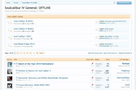
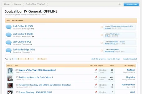
I have a style issue with this theme... both can be seen here:
http://www.8wayrun.com/forums/soulcalibur-iv-general-offline.38/
1 - sub forum list is UGLY...
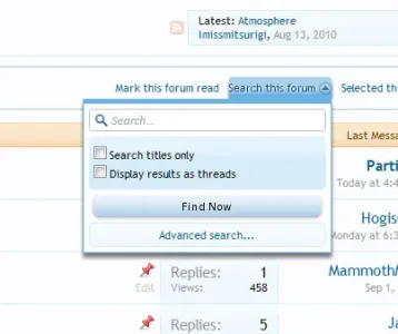
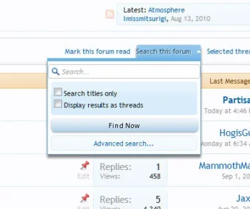
2 - open the "search this forum" menu... it doesn't look right.
http://www.8wayrun.com/forums/soulcalibur-iv-general-offline.38/
1 - sub forum list is UGLY...
2 - open the "search this forum" menu... it doesn't look right.
Peggy
in memoriam 2016
The menu for search looks fine Jason, except that the text area (where you enter your text to search for) is too wide, cutting off the borders on the left and right.I have a style issue with this theme... both can be seen here:
http://www.8wayrun.com/forums/soulcalibur-iv-general-offline.38/
1 - sub forum list is UGLY...
2 - open the "search this forum" menu... it doesn't look right.
I'm not sure what you think is ugly about the sub-forum list?
Peggy
in memoriam 2016
yeah I looked at all of it. The search menu is the same except for that search text area is too wide on Flexile.And the shadow needs to be removed from the Search This Forum link to make it easier to read.
But for the sub-forums - the only thing I can see that looks not nice is the large forum status icons.
Those things need resizing, even for the main forum page.
But for the sub-forums - the only thing I can see that looks not nice is the large forum status icons.
Those things need resizing, even for the main forum page.
Erik
Well-known member
I have a style issue with this theme... both can be seen here:
http://www.8wayrun.com/forums/soulcalibur-iv-general-offline.38/
1 - sub forum list is UGLY...
2 - open the "search this forum" menu... it doesn't look right.
- In xenforo_sections.css, find this CSS:
and replace with:Code:#forums.sectionMain { padding: 10px 0; margin: 0 0 10px; }
Code:.forum_list #forums.sectionMain { padding: 10px 0; margin: 0 0 10px; } - To fix the second issue, replace the entire xenforo_popup.css template with the attached file. If you want to give some padding to the drop down link (it looks weird when active, I agree), edit public.css and find this bit:
Then give it some horizontal padding. Try something likeCode:.linkGroup a { display: block; float: left; margin-left: 10px; padding: 3px 0; }Code:padding: 3px 5px;
Attachments
- Status
- Not open for further replies.
Similar threads
- Replies
- 0
- Views
- 295
- Replies
- 1
- Views
- 617
- Replies
- 5
- Views
- 968
- Replies
- 15
- Views
- 3K
