You are using an out of date browser. It may not display this or other websites correctly.
You should upgrade or use an alternative browser.
You should upgrade or use an alternative browser.
Flat Awesome Dark - PixelExit.com [Deleted]
- Thread starter Russ
- Start date
-
- Tags
- pixel exit
For your setup I think this would work:
Code:
#eAuthUnit li * {
    text-align: center;
    padding: 0px;
}
Apply that to your extra.css
Additionally you may need to increase this width:
Style Properties: Login Bar -> External Authentication Button Width
It should help with the steam overlapping that border.
Or... you could just remove that border with this CSS:
Code:
body #loginBar form.eAuth .ctrlWrapper {
    border-width: 0px;
}Yeah it didn't work can i move the discord button to the side instead of the steam auth button ?
Try this as well:
Code:
#loginBar form.eAuth #eAuthUnit {
    text-align: center;
}Try this as well:
Code:#loginBar form.eAuth #eAuthUnit { text-align: center; }
works tyvm. Awesome theme btw.
Last edited:
This is what i changed it to myself with some css. I think it looks good right?May need a login to debug it, our free version doesn't have this built in.
Our paid version has this built inside and aligns correctly out of the box.
If you want to PM me a login I can take a look.

This is what i changed it to myself with some css. I think it looks good right?

Looks good, let me know if you need any further help.
Can you update this for 1.5.13
The latest version of FA should work fine on 1.5.13 with no outdated templates.
Russ updated Flat Awesome Dark - PixelExit.com with a new update entry:
1.5.14 Style Update
Read the rest of this update entry...
1.5.14 Style Update
Simple update that brings the style up-to-date for XenForo 1.5.14.
Read the rest of this update entry...
Can you update for 1.5.14 please there seem to be outdated templates. navigation and thread_view.
Done
How did u do that?This is what i changed it to myself with some css. I think it looks good right?

Hey @Russ, how do I add things to the footer?
Edit the Footer template, free style doesn't have our advanced footer setup as the paid one but you can still edit the basic XF links via that template.
Thank you again! Ur support is very much appreciatedEdit the Footer template, free style doesn't have our advanced footer setup as the paid one but you can still edit the basic XF links via that template.
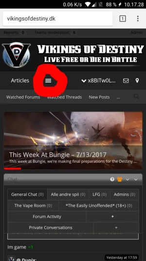
Is it possible to remove the the quick links menu and just show all menu items? - maybe move the user, messages and notification items to the top at the same time?

Thank you again! Ur support is very much appreciated
Is it possible to remove the the quick links menu and just show all menu items? - maybe move the user, messages and notification items to the top at the same time?
View attachment 155072
Not an easy way no, XF controls the navigation responsiveness via javascript.

