weird ! I see this & where in options do I add this text ?This is what I see.
View attachment 289459
You also need to update the description text in the options.
View attachment 289460
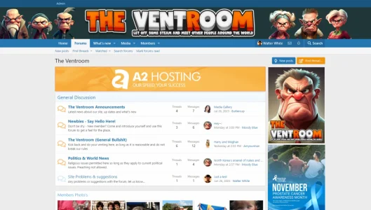
weird ! I see this & where in options do I add this text ?This is what I see.
View attachment 289459
You also need to update the description text in the options.
View attachment 289460

I fixed the off - but it is also okay to say " meet other people around the world".You've got a typo in your banner: "let of some steam and meet other people around the world". It should be "let off some steam and meet other people from around the world". The bold bits are the corrections.
It's a great banner otherwise.
Yeah, I guess you're right. Seemed to read better with the from there, but it's really just a style issue now I think about it. Great banner.I fixed the off - but it is also okay to say " meet other people around the world".
I found it and now fixed - thank you - but how can I stop this happening with the header - as it looks okay on my side ?This is what I see.
View attachment 289459
You also need to update the description text in the options.
View attachment 289460
The problem with your header is that your logo is sitting on top of a background cover and depending on what device is being used to view your site, what browser is being used and at what resolution will determine how it looks. This is currently how I see it:but how can I stop this happening with the header - as it looks okay on my side ?

Thank you- I will look into this- and that isn't the logo which is showing right now - changed that ages ago ! strange !!!The problem with your header is that your logo is sitting on top of a background cover and depending on what device is being used to view your site, what browser is being used and at what resolution will determine how it looks. This is currently how I see it:
View attachment 289485
I'm viewing this using a mac mini m2 pro, using chrome on a 27" 4K monitor. As I pointed out earlier it would be better if your grumpy men could be incorporated into your logo. It would probably be wise to have different logos for different break points using @ media commands in your extra.less file to state which logo is used at what break points. It's more work, but cosmetically it will keep your logo sweet and on point on different devices. I can't speak for browsers as I only use Chrome; just a personal preference thing lol.
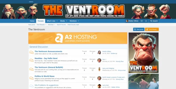
Thank you so much- you have made my dayI would honestly say that is 100% better than previously. Well done, you've picked a good theme by a top-notch author, and you've given it your own stamp to significant effect. Hope you do well with the site and get loads of traction.
View attachment 289855View attachment 289856
Where can I find this to activate ?Now it's much nicer.
A curiosity... did you make the images of the characters you use in your forum?
Then activate the "Mirror attachments from forums" so all the photos attached in the treads/posts will go in the gallery.
That's a super theme, really like it. Dark mode on!Well, took some advice from some comments made- bought a custom theme and worked around with it.
It looks like this now https://theventroom.com/
light & dark mode.

We use essential cookies to make this site work, and optional cookies to enhance your experience.