You are using an out of date browser. It may not display this or other websites correctly.
You should upgrade or use an alternative browser.
You should upgrade or use an alternative browser.
Soft Responsive [Deleted]
- Thread starter Arty
- Start date
Adam Howard
Well-known member
I did some "voodoo magic"Find this blockand move it afterCode:<header> <xen:include template="header" /> <xen:edithint template="navigation" /> <xen:edithint template="search_bar" /> </header>Code:<div id="headerMover">
Which is my way of saying I played with things I'm not 100% about, am not 100% sure of the long term affects, but still got the desired result (I think?).
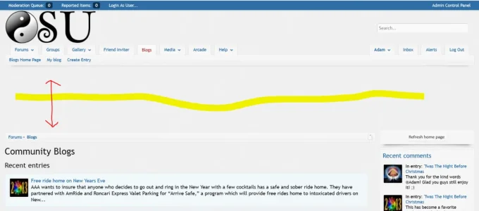
I did as you said, but ended up with this long gap
xfa_blog_PAGE_CONTAINER_normal
PHP:
<div id="headerMover">
<header>
    <xen:include template="header" />
    <xen:edithint template="navigation" />
    <xen:edithint template="search_bar" />
</header>
<div id="headerProxy"></div>
- I tried moving it 1 above and that ended up pushing it into the moderator bar (should have known better).
- I tried moving it 1 more line below and that only moved it further down.
On a hunch (best educated guess).... I figured out this was an issue
PHP:
<div id="headerProxy"></div>And sure enough when I commented it out.... Everything looked wonderful.
But I'm not exactly sure the full worth of "header proxy" in his add-on and so commenting it out didn't "feel right"
So I decided to move that 1 line above and keep to what you suggested. So the end result was this
PHP:
<div id="headerProxy"></div>
<div id="headerMover">
<header>
    <xen:include template="header" />
    <xen:edithint template="navigation" />
    <xen:edithint template="search_bar" />
</header>^^ That seems to work. Although I'd called it, "Voodoo Magic"
Adam Howard
Well-known member
I've gone over the style top and bottom.... Have to say, well done. 

One of the reasons why I normally do not buy paid styles is more than often there are tons, sometimes even hundreds of incompatibility issues with my current setup. With your style this is clearly not the case and I'm well impressed.
So again.... Nicely done.


With this said.... After going over everything top to bottom... I could find only 1 issue (that I'm unsure how to resolve). It's not mission critical (per say), but it is noticeable.
GoodForNothing Url Anonymizer/Redirector
http://xenforo.com/community/resources/goodfornothing-url-anonymizer-redirector.702/
Seems to have the same issue as this, but worse (a lot worse)
http://xenforo.com/community/threads/soft-responsive-paid.37010/page-19#post-461056
The width is extremely off....
Will be slowly looking over code in hopes to find a solution. I kind of depend on that little add-on as I use it as a measure of security in part (to let people know they've click a link that leads them outside the site)
One of the reasons why I normally do not buy paid styles is more than often there are tons, sometimes even hundreds of incompatibility issues with my current setup. With your style this is clearly not the case and I'm well impressed.
So again.... Nicely done.
With this said.... After going over everything top to bottom... I could find only 1 issue (that I'm unsure how to resolve). It's not mission critical (per say), but it is noticeable.
GoodForNothing Url Anonymizer/Redirector
http://xenforo.com/community/resources/goodfornothing-url-anonymizer-redirector.702/
Seems to have the same issue as this, but worse (a lot worse)
http://xenforo.com/community/threads/soft-responsive-paid.37010/page-19#post-461056
The width is extremely off....
Will be slowly looking over code in hopes to find a solution. I kind of depend on that little add-on as I use it as a measure of security in part (to let people know they've click a link that leads them outside the site)
You want to share what was causing it? I have been trying to wrap my head around it, but I can't figure out how it manages to have a width of 100% exceed the parent container...editor: that bug is fixed on my dev version, so it will be included in next update
Thanks, found it:
In forms.css. Instead of changing it to 0, which would, among other things, offset the title field, I just removed the MCE part, so it looks like this instead:
Code:
.xenForm .ctrlUnit.fullWidth dd .textCtrl,
.xenForm .ctrlUnit.fullWidth dd .explain,
.xenForm .ctrlUnit.fullWidth dd .mceLayout
{
    margin-left: @ctrlUnitEdgeSpacer;
}
Code:
.xenForm .ctrlUnit.fullWidth dd .textCtrl,
.xenForm .ctrlUnit.fullWidth dd .explain {
    margin-left: @ctrlUnitEdgeSpacer;
}
Arty updated Soft Responsive with a new update entry:
Bug fix update
Read the rest of this update entry...
Bug fix update
Version 2.0.4 is now available.
Changes from version 2.0.3:
- Bug fixes
Read the rest of this update entry...
NopeHi Arty
Any image changes in this version?
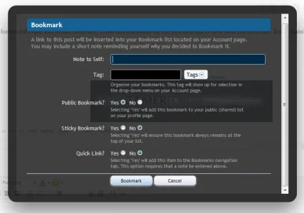
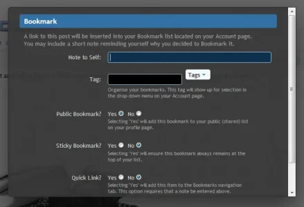
When trying to bookmark a post there are many gaps which cause the overlay to extend vertically.
When you have tags, the tags drop down menu does not sit in the right location.
When viewing the bookmarks on the account page, the page layout does not extend all the way down.
Also the tag name is no longer clickable.
Since it all works as it should in default style I assume it all has to do with Arty's style
Arty... noticing some issues with the Bookmarks add-on:
Default style: ... Soft Responsive


A real newbie question here - do most of the "stock" template css edits, such as separating stickie threads, etc. also work in this theme?
Or, if not, can we somehow get a repository of such common edits as opposed to searching thought this discussion?
For starters, I do want to separate and possibly color the stickies.....
Or, if not, can we somehow get a repository of such common edits as opposed to searching thought this discussion?
For starters, I do want to separate and possibly color the stickies.....
