Forsaken
Well-known member
You can limit tapatalk for certain groups (Which is what I'm doing once I launch my site).Well that sucks, and the only alternative i have is to allow my members to use Tapatalk? -__-
You can limit tapatalk for certain groups (Which is what I'm doing once I launch my site).Well that sucks, and the only alternative i have is to allow my members to use Tapatalk? -__-
I've done some test uploads using the iPhone, and it's rotating the images like you said above. It works OK though, apart from the image being rotatedI had never attempted it, and just tried with my Samsung S3. It adds it, for some reason on mine, it rotated it. Might be the way I took the photo though.
On the Android OS, it gave me the option for grabbing the image like any other time, files, gallery, etc... select to add as a thumb or full image.

I've done some test uploads using the iPhone, and it's rotating the images like you said above. It works OK though, apart from the image being rotated
The first one was taken portrait (talking position) and was rotated. I've just taken a picture landscape, and it didn't rotate it.Do you take your photos with your phone up? Or on its side?
The ones I did, I know my phone was up (like in talking position). Curious if taking one on its side will change it.
The first one was taken portrait (talking position) and was rotated. I've just taken a picture landscape, and it didn't rotate it.
.xenOverlay.attachmentUploader { width: 290px !important; }I can add it as option for next version, so if you really need to you could quickly enable notices.
And is this being adjusted in the responsive templates or my default template?
/*Mobile CSS*/
@media only screen and (max-width: 700px), only screen and (max-device-width: 700px)
{
#moderatorBar, #moderatorBar div {
    padding-bottom: 30px !important;
}
}#header_bar .itemLabel { padding-top: 5px; }.breadBoxTop, .breadBoxBottom { margin-left: 0 !important; margin-right: 0 !important; padding-left: 0 !important; padding-right: 0 !important; }.navTab.selected div.navLink a.navDivLink { color: #56575A !important; text-shadow: none; height: auto; background-image: none; }

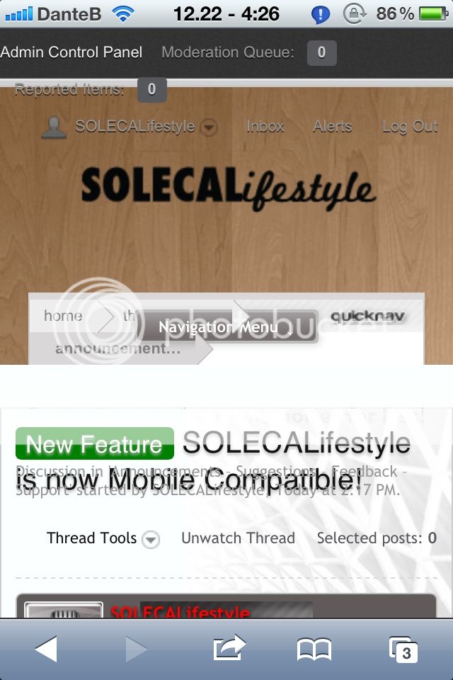
Header bar has fixed height and background image that is designed only for that fixed height. You'll have to ether completely remove it or live with notice in header that is very hard to see. Add this to responsive_extra.cssCode:#header_bar .itemLabel { padding-top: 5px; }
Navigation menu should be moved above. It can be done by reducing height of logo block, its too high for such small logo. In style properties -> responsive design: header, set logo height to something like 90px
To fix breadcrumbs add this to responsive_extra.cssCode:.breadBoxTop, .breadBoxBottom { margin-left: 0 !important; margin-right: 0 !important; padding-left: 0 !important; padding-right: 0 !important; }
In navigation menu current item looks weird. Add this to responsive_extra.css to fix itCode:.navTab.selected div.navLink a.navDivLink { color: #56575A !important; text-shadow: none; height: auto; background-image: none; }
We use essential cookies to make this site work, and optional cookies to enhance your experience.