When i make a thread the box just doesn't seem to really blend. I wish it was fit to the end of the style and same with signature it just seems placed their really. Maybe redo the grey with the blue of the board to make it blend better?
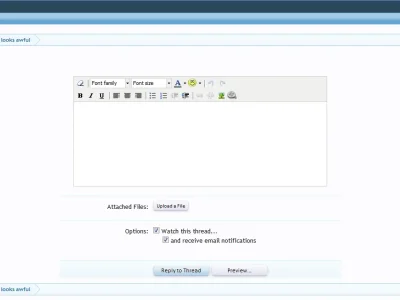
I'm guessing this is already on the list but the text editor (simple and advanced) looks like a throwback/add on and doesn't do the software any favours.
Every time I see it, it reminds me of all the things I don't like about other forum software.
I'm guessing this is already on the list but the text entry box (simple and advanced) looks like a throwback/add on and doesn't do the software any favours.
Every time I see it, it reminds me of all the things I don't like about vB.
I'm guessing this is already on the list but the text entry box (simple and advanced) looks like a throwback/add on and doesn't do the software any favours.
Every time I see it, it reminds me of all the things I don't like about vB.
This being an unreleased early alpha version of the software, I think it's a given that a few things just won't be dazzling right now. Besides I can't see Kier & Co. letting the editor remain as is.
")