You are using an out of date browser. It may not display this or other websites correctly.
You should upgrade or use an alternative browser.
You should upgrade or use an alternative browser.
Implemented Head Navigation Tab
- Thread starter bookmark
- Start date
This suggestion has been implemented. Votes are no longer accepted.
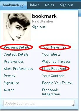
Dropping the 'Account' tab and using the username area to achieve the same functionality has been on my todo list for some time.
Nick
Well-known member
Yeah, something happened because it marked a post I had already read before as unread.Woah, some freaky thread mergeration just happened
This may seem at odds with my previous post, but dropping the whole "my account" tab might be the best thing to do.Dropping the 'Account' tab and using the username area to achieve the same functionality has been on my todo list for some time.
IMO, good UI design provides for different ways to do the same thing, because we each think differently.
Having links more than once in a header-navigation-bar is just double-dipping and users are getting confused.
I am already confused by all those links.... but missing a direct link towards my own Profile-page within the Profile-Drop-Down-box.
Nick
Well-known member
Click your username.but missing a direct link towards my own Profile-page within the Profile-Drop-Down-box.
Or click on the tab with your username twice.Click your username.
Click your username.
ahhh, right.
I just do not recognize black-colored text as being links, especially when they are not underlined......
We don't advertise all our functionality. Some things are blended into the background in order to be discovered by those who go looking.ahhh, right.
I just do not recognize black-colored text as being links, especially when they are not underlined......
It's part of a philosophy of not bombarding the user with hundreds of controls and links everywhere.
We don't advertise all our functionality. Some things are blended into the background in order to be discovered by those who go looking.
It's part of a philosophy of not bombarding the user with hundreds of controls and links everywhere.
Thanks !
Did you hire a screen-designer or some kind of psychologist for the UI-design of XF ?
Kier doesn't qualify for those two titles?Did you hire a screen-designer or some kind of psychologist for the UI-design of XF ?
That would be the main reason I appreciate the design Xenforo.We should make things simple and deliver clear site map and cross link to the user.It's part of a philosophy of not bombarding the user with hundreds of controls and links everywhere.
As another suggestion,why we don't combine the "sign out" tab into the username area?
I had that originally, but in early testing we had several requests for a visible sign-out link that was not buried in a menu - I thought those were probably reasonable requests.As another suggestion,why we don't combine the "sign out" tab into the username area?
As another suggestion,why we don't combine the "sign out" tab into the username area?
it is there already.
I mean to drop the separate "sign in"tab,not having two tabs for sign out function.it is there already.
Anyway,it's only a trivial matter.
I mean to drop the separate "sign in"tab,not having two tabs for sign out function.
Anyway,it's only a trivial matter.
Kier is right: the "Sign out" should not be buried in a sub-menu or drop-down-menu.
This needs to be clearly visible as it is.
Having it additionally within the Drop-Down-box, does not hurt at all.
Dropping the 'Account' tab and using the username area to achieve the same functionality has been on my todo list for some time.
And... it has been done! http://xenforo.com/community/threads/navigation-area-update.2449/
So much better: it really improves the navigation on XenForo, as rightfully pointed out by customers above. */note to self: reserve money for a future XenForo purchase*
It is much better!And... it has been done! http://xenforo.com/community/threads/navigation-area-update.2449/
So much better: it really improves the navigation on XenForo, as rightfully pointed out by customers above. */note to self: reserve money for a future XenForo purchase*
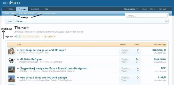
I still think while viewing the Forums it should be 'mark as read' - 'Watched Threads' - 'Whats New' (swapping the mark as read & whats new) edit: like in this picture:
![[Implemented] Head Navigation Tab - Page 2 - XenForo Community_1282330847773.webp [Implemented] Head Navigation Tab - Page 2 - XenForo Community_1282330847773.webp](https://xenforo.com/community/data/attachments/1/1119-a4ab410f7f89fa0809fde400c102cf54.jpg?hash=pKtBD3-J-g)
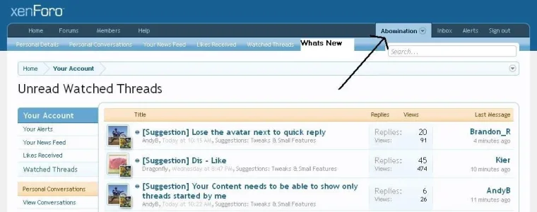
When the 'Watched Threads' is clicked it goes you 'your account', it would really be a time saver to have a 'Whats New' button as the far right button, just next to the 'Watched threads'. edit: added picture:

.
.
Personally I really do not see the need to have the 'your account' page show up when viewing Watched Threads, a simple list of watched threads without all the options on the left hand side, which is rarely used compared to Watching Threads, would be excellent. The Your Account page (the same as it is now) would still come up by clicking on the the users name on the right hand side. edit: adding picture. This might be a much cleaner Watched Threads view (also shows swapping the other 2 buttons)

Similar threads
- Replies
- 0
- Views
- 33
- Replies
- 0
- Views
- 63
- Question
- Replies
- 1
- Views
- 24
- Question
- Replies
- 1
- Views
- 50
- Question
- Replies
- 2
- Views
- 36

