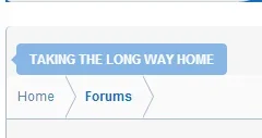
@brstrm ?How to fix this alignment?
View attachment 72773
Cache TTL and Purge Cache link are features of @xfrocks BD Cache
You are using an out of date browser. It may not display this or other websites correctly.
You should upgrade or use an alternative browser.
You should upgrade or use an alternative browser.
Drift - Dark 1.5.22.0
No permission to download
- Thread starter Dad.
- Start date
Falkor
Member
@brstrm, Thanks I ended up having to remove all the styles and install them all again in the order as you suggested.
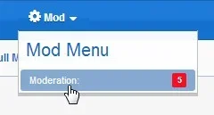
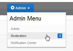
The one thing that we still need is the moderation alerts for the moderators as they now have no idea that we have anything in moderation that needs attending to.
As you can see in the screen captures there is no bubble notification for this in both the Mod and Admin option and you actually need to go to the option and look in the drop down menu to see if there are any items that need attending to.


Last edited:
brstrm
Active member
@brstrm, Thanks I ended up having to remove all the styles and install them all again in the order as you suggested.
The one thing that we still need is the moderation alerts for the moderators as they now have no idea that we have anything in moderation that needs attending to.
The alerts are not plainly visible without hovering over the admin dropdown. There just simply isn't enough space to not utilize a dropdown. Moving the visitor tabs to the navigation will fix the problem. However, we've noted this and plan on adding an alert to the admin dropdown that tallies alerts.
We're using the Xenforo convention classes of .navTabs, .navTab, and .navLink for links found in the userbar. We may have to adjust how we're currently handling this, as we can't expect plugin developers to add these classes. Would you mind creating a ticket and linking to a live demo where that link would be visible to us? Thanks.
Invited you to a Conversation.The alerts are not plainly visible without hovering over the admin dropdown. There just simply isn't enough space to not utilize a dropdown. Moving the visitor tabs to the navigation will fix the problem. However, we've noted this and plan on adding an alert to the admin dropdown that tallies alerts.
We're using the Xenforo convention classes of .navTabs, .navTab, and .navLink for links found in the userbar. We may have to adjust how we're currently handling this, as we can't expect plugin developers to add these classes. Would you mind creating a ticket and linking to a live demo where that link would be visible to us? Thanks.
brstrm
Active member
Thanks that is a bit better but would have liked the bubble notification back.
The bubble notifications are sometimes cut off on certain style property configurations. They likely will not be added back in.
[EDIT] But we do plan on adding some sort of notification on the admin drop-down menu.
We will be hiding the slogan when Drift's Mode is enabled in a future release. There simply is not enough space. You can choose to toggle off Drift's mode if you'd like to have the slogan.
Hello, I am using DRIFT dark as my main theme for my test site, but I have made it into a light theme as I only wanted the black navbar/Logo container in Drift mode.
I have been trying to change the colour or get rid of the borders in the thread list but can't find a style property to remove it. I have tried adding code to extra.css but with no luck.
This is my code.
Also tried making it !important but with no luck.
By the way, great theme, and good work, though the latest version has more bugs then the last, at least for me. I also have some suggestions for a next update. I will report over the weekend.
Many Thanks
I have been trying to change the colour or get rid of the borders in the thread list but can't find a style property to remove it. I have tried adding code to extra.css but with no luck.
This is my code.
Code:
.discussionListItem
{
border-bottom: 1px solid;
border-color: white;
}
Also tried making it !important but with no luck.
By the way, great theme, and good work, though the latest version has more bugs then the last, at least for me. I also have some suggestions for a next update. I will report over the weekend.
Many Thanks
brstrm
Active member
Hello, I am using DRIFT dark as my main theme for my test site, but I have made it into a light theme as I only wanted the black navbar/Logo container in Drift mode.
I have been trying to change the colour or get rid of the borders in the thread list but can't find a style property to remove it. I have tried adding code to extra.css but with no luck.
This is my code.
Code:.discussionListItem { border-bottom: 1px solid; border-color: white; }
Also tried making it !important but with no luck.
By the way, great theme, and good work, though the latest version has more bugs then the last, at least for me. I also have some suggestions for a next update. I will report over the weekend.
Many Thanks
Hi there.
To answer your question, the UI.X's css takes precedent over all other css templates, including EXTRA.css. You'll want to create your own template for custom edits as per our documentation here http://www.audentio.com/documentation/uix#customCSS. Great job with your customizations!
Also, we welcome all reports and are grateful for it. Many bugs have been fixed in our products since the introduction of the userbar concept into our framework. We'll be pushing out updated products for 1.3.2 soon!
Thanks
@brstrm
Many thanks, I will take a look at the link when I get the chance and have a read. Also thanks for the compliments for the site. I am a complete noob and just used the options available in your theme/xenforo as well as a few plugins to design the way I like. Any minor code edits have been a copy and paste suggested/found from members/staff here and pasted in extra CSS. I will eventually combine wordpress with the site so will have many dumb questions for you guys at a later date. Though first just tweaking with xenforo. Any way, however good my site looks now in early stages is a testament to xenforo and your fantastic theme.
Also I am having problems with Padding in the resource manager. Looked high and low for a style var to edit but can't find. To fix the padding do I need to create my own template as you described? Problem here
Also, in the resource manager to get rid of the border around the resources do I have to create my own template? HERE
One last question, is it possible to have the Move Logo to Navigation only in mobile/responsive view? When logo is not in navbar there is way to much space taken up with a large logo/navbar/links. If I change tick Move Logo to Navigation i get the desired outcome in responsive view, but in full size (on a PC) I have a little logo.
Here is an example of too much space

And here is how I would like it to be

I have fixed navigation so it is not a major issue but would like the cleaner look from the start. Can an easy template mod give me the results I want, and/or would you consider this feature in an update?
Many Thanks
Regards
Ryan
Many thanks, I will take a look at the link when I get the chance and have a read. Also thanks for the compliments for the site. I am a complete noob and just used the options available in your theme/xenforo as well as a few plugins to design the way I like. Any minor code edits have been a copy and paste suggested/found from members/staff here and pasted in extra CSS. I will eventually combine wordpress with the site so will have many dumb questions for you guys at a later date. Though first just tweaking with xenforo. Any way, however good my site looks now in early stages is a testament to xenforo and your fantastic theme.
Also I am having problems with Padding in the resource manager. Looked high and low for a style var to edit but can't find. To fix the padding do I need to create my own template as you described? Problem here
Also, in the resource manager to get rid of the border around the resources do I have to create my own template? HERE
One last question, is it possible to have the Move Logo to Navigation only in mobile/responsive view? When logo is not in navbar there is way to much space taken up with a large logo/navbar/links. If I change tick Move Logo to Navigation i get the desired outcome in responsive view, but in full size (on a PC) I have a little logo.
Here is an example of too much space

And here is how I would like it to be

I have fixed navigation so it is not a major issue but would like the cleaner look from the start. Can an easy template mod give me the results I want, and/or would you consider this feature in an update?
Many Thanks
Regards
Ryan
brstrm
Active member
@brstrm
Many thanks, I will take a look at the link when I get the chance and have a read. Also thanks for the compliments for the site. I am a complete noob and just used the options available in your theme/xenforo as well as a few plugins to design the way I like. Any minor code edits have been a copy and paste suggested/found from members/staff here and pasted in extra CSS. I will eventually combine wordpress with the site so will have many dumb questions for you guys at a later date. Though first just tweaking with xenforo. Any way, however good my site looks now in early stages is a testament to xenforo and your fantastic theme.
Also I am having problems with Padding in the resource manager. Looked high and low for a style var to edit but can't find. To fix the padding do I need to create my own template as you described? Problem here
Also, in the resource manager to get rid of the border around the resources do I have to create my own template? HERE
One last question, is it possible to have the Move Logo to Navigation only in mobile/responsive view? When logo is not in navbar there is way to much space taken up with a large logo/navbar/links. If I change tick Move Logo to Navigation i get the desired outcome in responsive view, but in full size (on a PC) I have a little logo.
Here is an example of too much space

And here is how I would like it to be

I have fixed navigation so it is not a major issue but would like the cleaner look from the start. Can an easy template mod give me the results I want, and/or would you consider this feature in an update?
Many Thanks
Regards
Ryan
Yes, you'll find that you'll likely have to make custom edits for the resource list issues. That's to be expected though when making a dark theme a light theme. Perhaps you may want to consider creating another Drift Light and simply overwriting the image files with Drift Dark's images. That may result in less work, and you'll have the black navigation!
Also, you may want to upgrade your UI.X copy to the latest release, 1.3.1.1. It fixes some important bugs that may rear their ugly heads in Firefox.
As far as consolidating the space on mobile, that isn't a bad idea. Currently, you can check on the "Logo to Navigation" setting, and that will get the consolidated look you are going for. However, it will also affect desktop views. I'll see if I can try incorporating a "Fixed on Load for Mobile" setting for the next release.
Hey Thanks
Yeah I realized a little while ago that my UI.X was out of date, while my drift theme was upto date.
I will re make a new theme and copy the images over to drift light though I am using drift light for another part of my forum and need to use the lighter images for that. How will that work?
Also can't find where to edit the about at the footer ?
Audentio updated [UI.X] Drift - Dark with a new update entry:
Major search/navigation improvements and updated to 1.3.2
Read the rest of this update entry...
Major search/navigation improvements and updated to 1.3.2
See full release notes here: http://xenforo.com/community/resources/ui-x.2239/update?update=9976
Read the rest of this update entry...
brstrm
Active member
Roldan,I know Style properties doesn't display any notice whether it's outdated.
So with the latest update, what are the style properties that has been changed?
So that I will revert that style properties and re-apply my custom changes, Thanks!
We haven't logged a list of the style properties that differ from the previous version of the theme. You may want to click through the Header and Navigation, UI.X User Bar, General > Content, and Breadcrumb style property groups and reset those properties. We've also consolidated some Navigation settings in the UI.X Navigation group. You'll find that the left-floated logo is now built into UI.X and the Drift Panel Width is now Logo Block Width for Navigation Style 3.
Quick navigation icon was gone?
Please take a look.
Please take a look.
brstrm
Active member
Yes, this is a bug left over from development. We'll push a patch soon.Quick navigation icon was gone?
Please take a look.
Will try to get him to post em up later.@brstrm So what are the style properties changed from v1.3.2.0 to v1.3.2.1?
I saw the update just now.
Similar threads
- Replies
- 2
- Views
- 75
- Replies
- 1
- Views
- 20
- Replies
- 1
- Views
- 35
