You are using an out of date browser. It may not display this or other websites correctly.
You should upgrade or use an alternative browser.
You should upgrade or use an alternative browser.
Soft Responsive [Deleted]
- Thread starter Arty
- Start date
^ I'm getting that too with that add-on. I think it's a problem with the add-on because it was doing the same for me on the default style earlier.
From what I gather, the dev (of that add-on) is looking into it.
Banana Pup
Well-known member
Does this style require your branding to remain in the footer? Ready to purchase but don't see any info on that.
A couple different looks...
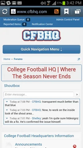
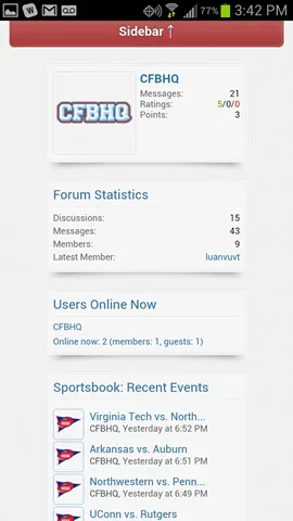
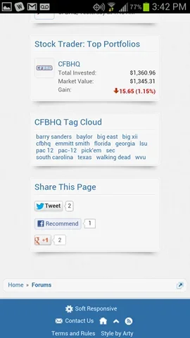

Only have a couple things I really need to tweak, but honestly, this is the best theme purchase I have made so far. I support all of the themers out there, but this one has just blown me away. I think it is essential for a site that wants to have any type of mobile audience.


Only have a couple things I really need to tweak, but honestly, this is the best theme purchase I have made so far. I support all of the themers out there, but this one has just blown me away. I think it is essential for a site that wants to have any type of mobile audience.
That looks nice. Try adding this to extra.css to adjust poster profile's layout:
Code:
@media only screen and (max-width: 700px), only screen and (max-device-width: 700px)
{
    .messageUserBlock .extraUserInfo
    {
        padding: 0;
    }
        .messageUserBlock .extraUserInfo dt
        {
            display: inline;
        }
    .messageLeft .messageUserBlock h3.userText
    {
        float: right;
        text-align: right;
  }
    .dark_postrating_bar_dd
    {
        display: none !important;
    }
}Very nice.
Question to those who advertise: "how do you plan on doing it with this skin?"
I'd love to use it but gotta pay the bills too.
Question to those who advertise: "how do you plan on doing it with this skin?"
I'd love to use it but gotta pay the bills too.
This is great, purchased.
Add background-color to #logoBlock in css, like this:
If you'll be using it with fixed width layout, right border will cause conflict with your header background, so you'll have to remove it by adding this to extra.css
If you want to change only middle of header, not whole block, instead of changing color for #logoBlock, change it for #logoBlock .pageWidth, like this:
It will look something like this:
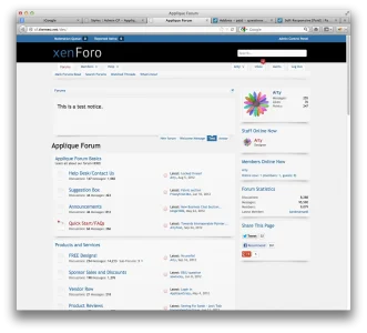
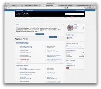
That's quick hack with background color. I recommend using image with gradient instead of raw color to make transition from header to content area nicer.
Code:
#logoBlock { background-color: #000; }If you'll be using it with fixed width layout, right border will cause conflict with your header background, so you'll have to remove it by adding this to extra.css
Code:
.hasJs #headerMover:before, .hasJs #headerMover:after, .hasJs #forumFooter:before, .hasJs #forumFooter:after { display: none !important; }If you want to change only middle of header, not whole block, instead of changing color for #logoBlock, change it for #logoBlock .pageWidth, like this:
Code:
#logoBlock .pageWidth { background-color: #000; border-bottom-left-radius: 6px; border-bottom-right-radius: 6px; }It will look something like this:


That's quick hack with background color. I recommend using image with gradient instead of raw color to make transition from header to content area nicer.
I'm in love with this theme.
I'm in love with this theme.
Same. Hahaha. I am almost scared to touch anything.
Arty, if this theme is any indication of what you might put out in the future... I'm going to need a bigger wallet.
