Xenforo 1.2 on an iphone

Digital Doctor

Well-known member
The new Responsive design is nice: great job !

1776.webp
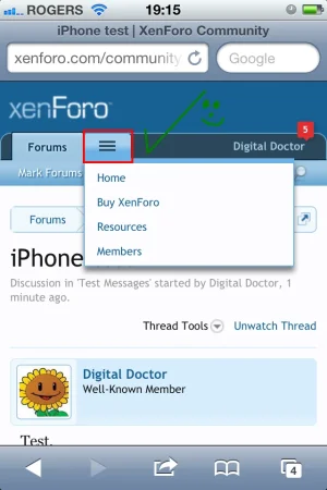
I noticed there are two search options: [Search Forums] and the Magnifying glass. Is there room for both ? I guess there is.

Mark Forums read .... no way it should occupy the most prime real estate !!!!
put new threads there !!! Bury Mark forums read underneath the ... :)

I think having the big long winded explanations of what the forum is made the Forum Home too long.

Suggestion: rip out the ....

Get the latest news and announcements about XenForo, including new releases and development updates.

Even the desktop version of the Forum Home doesn't have the big long explanations display (it's shown if you hover over).

Big long winded forum explanations and mobile forums aren't compatible.

 
Mark Forums read .... no way it should occupy the most prime real estate !!!!
put new threads there !!! Bury Mark forums read underneath the ... :)


Suggestion: rip out the ....

Agree.
Nobody needs "Mark Forums read" on a mobile.

Maybe also put the "Resources Tab" there....... if RM is installed and if there is sufficient room for that Tab.

:)
 
Last edited:
The descriptions would display on desktop if you had JavaScript turned off (and are actually only displayed as tool tips post load).

The order of what shows up in the sub navigation could be accomplished by changing the order of how they occur in the sub-navigation everywhere. If you put New Threads, Watched Forums first, everything else would be hidden.
 
As discussed previously ... the most useful part of the Members Tab is Recent Activity.
This should be the default display when people click the Members Tab.
Give people what they want !
If Xenforo.com mined their own click data you'd see people want Recent activity.
 
They do track activity on XenForo.com, and have commented on which parts are more actively used.
 
The descriptions would display on desktop if you had JavaScript turned off (and are actually only displayed as tool tips post load).
The usability of the Xenforo forum home is dramatically hit because of display the ultra long winded descriptions. Sacrificing usability is bad.

The order of what shows up in the sub navigation could be accomplished by changing the order of how they occur in the sub-navigation everywhere. If you put New Threads, Watched Forums first, everything else would be hidden.
[New Threads] should display first by default in 1.2
Easy access to Mark Forums read is more bug than feature.
New thread is the most used and most useful therefore it should have the prime real estate.
 
I actually agree with some of what DD is saying. I think more focus needs to be shifted to the social aspects of the software. Also, it just makes sense to place more commonly used items on the menu in responsive.
 
As a matter of safety I only install Jailbroken OS updates.
My phone isn't jailbroken, but I reserve the right for that option.

I only wanted to check one thing anyway ....
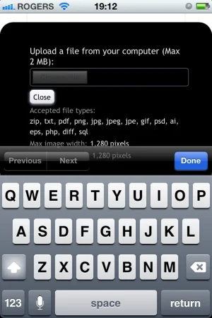
Can you go straight from Picture to Post in iOS, like the desktop can "paste" an image from the clipboard ?
 
Back
Top Bottom