JoyFreak
Well-known member
Now that’s an achievement!I woke up to see my logo represented on the official Toyota Instagram page.
Now that’s an achievement!I woke up to see my logo represented on the official Toyota Instagram page.


Wow, now that's feedback.I think it is the right idea to have a Youtube channel. Youtube's market is extremely big and you can get ton of exposure there and earn bucks.
Can't say much about the video content itself but I have a few points.
1) Your editing seems fine.
2) I think you should have some sort of "table of contents" of the start of the video. Like your video is 16 minutes long. Not many people will watch the whole thing. If you could provide a list like "you will see this and this and this", people could skip to the part they are interested in. You need to watch your retention rates for that but as this is your first video, you need more data of course to see a difference.
3) Since your channel is still young, I would think about a name change. Not sure if it is allowed to use Tacoma3g as a part of your name, but if it is possible, then definitely use it. Not many people will search for "wandering" or "winterfields" and even if they do, it is probably unrelated to what they were after. I don't think that someone who searches for these words expects a tacoma content. Vice versa, someone who searches for Tacoma or Toyota content, will use these words. So for branding reasons this is very important.
But as I see, you launched this 2nd brand next to your site called wandering winterfields. So, I don't know if that is the right thing, you must decide.
4) Your thumbnail is not good. To be precise, the text color is bad (the picture is great!).
View attachment 218852
If you look at it, can you read what is written down below? I can not.
The red is too dark and the text is too small. You must make it more big. Don't forget that most people use a phone these days, so everyone has a small screen. You want them to be able to read it without thei reading glasses on.
Also if I am not mistaken the used red tone is not the tone of your logo. Why? Don't forget branding, if you choose the red color, choose your brand's color. I think you tried to do that actually as you have used similar colors in that picture, but not exactly.
And the text above is readable but it still blends in with the background, specially the left side. Making that bigger would help.
Also you could have sneaked in your brand in the title, but this is a very minor thing, not that important. For example like
View attachment 218850
Also instead of puttung your domain names down below, I would put the logos. That looks more professional.
You can't even see the right domain, because the time of the video is there.
I fixed the thumbnail, I think it looks cleaner now.I think it is the right idea to have a Youtube channel. Youtube's market is extremely big and you can get ton of exposure there and earn bucks.
Can't say much about the video content itself but I have a few points.
1) Your editing seems fine.
2) I think you should have some sort of "table of contents" of the start of the video. Like your video is 16 minutes long. Not many people will watch the whole thing. If you could provide a list like "you will see this and this and this", people could skip to the part they are interested in. You need to watch your retention rates for that but as this is your first video, you need more data of course to see a difference.
3) Since your channel is still young, I would think about a name change. Not sure if it is allowed to use Tacoma3g as a part of your name, but if it is possible, then definitely use it. Not many people will search for "wandering" or "winterfields" and even if they do, it is probably unrelated to what they were after. I don't think that someone who searches for these words expects a tacoma content. Vice versa, someone who searches for Tacoma or Toyota content, will use these words. So for branding reasons this is very important.
But as I see, you launched this 2nd brand next to your site called wandering winterfields. So, I don't know if that is the right thing, you must decide.
4) Your thumbnail is not good. To be precise, the text color is bad (the picture is great!).
View attachment 218852
If you look at it, can you read what is written down below? I can not.
The red is too dark and the text is too small. You must make it more big. Don't forget that most people use a phone these days, so everyone has a small screen. You want them to be able to read it without thei reading glasses on.
Also if I am not mistaken the used red tone is not the tone of your logo. Why? Don't forget branding, if you choose the red color, choose your brand's color. I think you tried to do that actually as you have used similar colors in that picture, but not exactly.
And the text above is readable but it still blends in with the background, specially the left side. Making that bigger would help.
Also you could have sneaked in your brand in the title, but this is a very minor thing, not that important. For example like
View attachment 218850
Also instead of puttung your domain names down below, I would put the logos. That looks more professional.
You can't even see the right domain, because the time of the video is there.


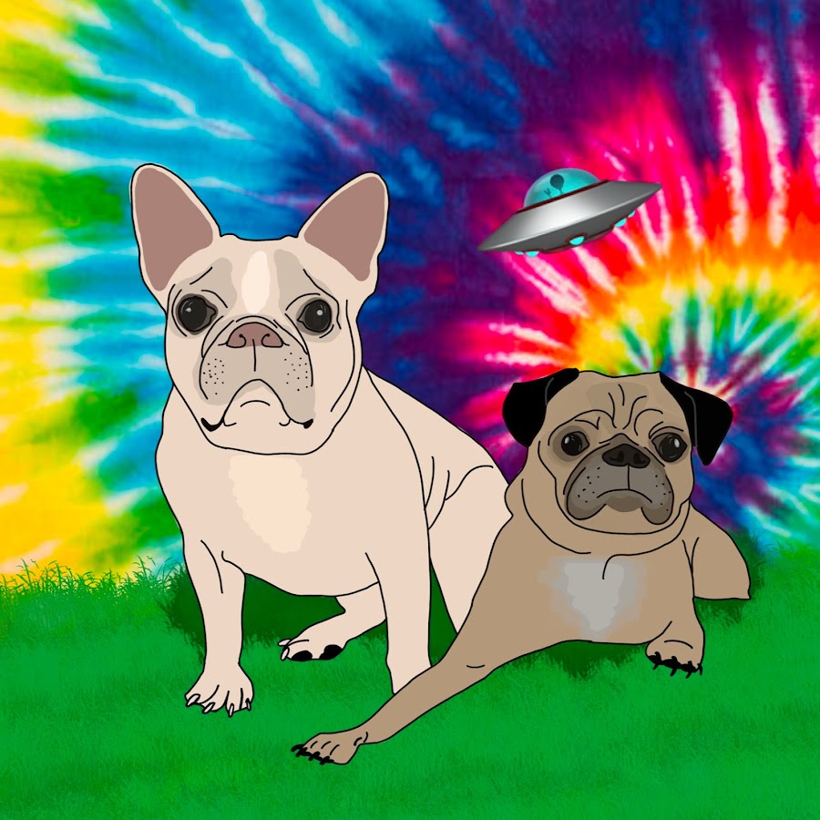
Which view can you not see the dogs? On a phone?Yep, much better. You also changed the red. Clean and sleek.
Maybe you could increase the font-size of the title a bit, just the height so it fits into the picture. But not sure if that is possible with the editor in your video software. Like this:
View attachment 219544
That way it can be read on the thumbnail which is not very readable right now. But this doesn't always work out for every font-size, it looks sometimes silly.
I also like the Youtube banner, that is perfect. Just the dogs can't be seen, that needs to be re-done.
I tweaked the dogs and also moved the whole thing up slightly so it doesn't touch that Instagram link. How does that look?
 www.youtube.com
I actually think it looks better on mobile than on desktop because on desktop it got blurry even though the image is HD. Here is mobile:Ah, now I understand why it is called the Winterfields. Your surname is that, it makes sense.
The dogs are perfect now and also the site looks good. Although not sure how it would look on mobile, as I think it is not responsive.
Btw. for the Youtube banner, see:
View attachment 219546

I didn't mean the youtube channel, I meant the website. Not sure how the website would look on mobile. Youtube is fine but try to consider those dimensions I gave you for the banner.I actually think it looks better on mobile than on desktop because on desktop it got blurry even though the image is HD. Here is mobile:
Oh, the mobile website is basically broken right now. I need to design that separately and I haven't gotten to it yet.I didn't mean the youtube channel, I meant the website. Nore sure how the website would look on mobile. Youtube is fine but try to consider those dimensions I gave you for the banner.
Lol, thank you! I did a lot to the audio to try to make our voices more clear and the wind noise more not. So I’m glad it worked.I couldn't find anything to criticize, nice video. Audio is great, thumbnail is great, video cuts are great, your humor isnotgreat, your wife is great.
We use essential cookies to make this site work, and optional cookies to enhance your experience.


