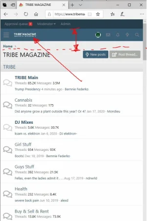
tribedude Active member Jan 27, 2020 #1 How can I control the size of our logo when someone visits our site from a phone? Currently our logo shrinks to a really tiny size. Ideally, we would like our logo larger in a phone viewport. How do we do this? Thanks, Attachments increase header thickness and logo board.webp 42.8 KB · Views: 27
How can I control the size of our logo when someone visits our site from a phone? Currently our logo shrinks to a really tiny size. Ideally, we would like our logo larger in a phone viewport. How do we do this? Thanks,
Ozzy47 Well-known member Jan 27, 2020 #2 This is what I have and it works well: CSS: // ########################### FULL SIZE LOGO ON MOBILE ######################## .p-nav-smallLogo { display: none !important; } .p-header-logo { max-width: none !important; } .has-js .p-header { display: block; } Upvote 0 Downvote
This is what I have and it works well: CSS: // ########################### FULL SIZE LOGO ON MOBILE ######################## .p-nav-smallLogo { display: none !important; } .p-header-logo { max-width: none !important; } .has-js .p-header { display: block; }
tribedude Active member Jan 28, 2020 #4 ozzy47 said: This is what I have and it works well: CSS: // ########################### FULL SIZE LOGO ON MOBILE ######################## .p-nav-smallLogo { display: none !important; } .p-header-logo { max-width: none !important; } .has-js .p-header { display: block; } Click to expand... Where do we put this? Upvote 0 Downvote
ozzy47 said: This is what I have and it works well: CSS: // ########################### FULL SIZE LOGO ON MOBILE ######################## .p-nav-smallLogo { display: none !important; } .p-header-logo { max-width: none !important; } .has-js .p-header { display: block; } Click to expand... Where do we put this?
Lukas W. Well-known member Jan 28, 2020 #5 tribedude said: Where do we put this? Click to expand... Appearance > Styles > [Your Style] > Templates > Search for extra.less template Upvote 0 Downvote
tribedude said: Where do we put this? Click to expand... Appearance > Styles > [Your Style] > Templates > Search for extra.less template
tribedude Active member Feb 1, 2020 #6 ozzy47 said: This is what I have and it works well: Click to expand... Thanks! That works so nicely and our mobile experience is so much better now. Upvote 0 Downvote
ozzy47 said: This is what I have and it works well: Click to expand... Thanks! That works so nicely and our mobile experience is so much better now.
")