Kenson’s Jurassic Kingdom - Family Friendly Gaming Community

KensonPlays

Well-known member
EDIT: We are no longer using "Jurassic Kingdoms" - New thread for the completely rebuilt site coming up.

The site has been around for a few weeks now, and I feel that ‘Version 1.0’ is in place.

I would love criticism on these areas specifically:
  • Board names/descriptions
  • Pages content (Home > other pages)
  • Overall theme/style
The site is brand new, about 1 month or less (since the move from Wordpress anyhow), so there isn’t really much content on it yet.

The theme is a ‘Dinosaur’ feel since that’s one thing my community in general loves. ARK Survival, and other dino-related games. We have sub-styles for other games that people might like.

Looking specifically for constructive criticism. Not really looking for “Deconstructive Criticism”.

The website/forum is located at https://jurassickingdoms.net
 
Last edited:
The site has been around for a few weeks now, and I feel that ‘Version 1.0’ is in place.

I would love criticism on these areas specifically:
  • Advertisement placements. (Using Adsenses’ “Auto Ad” feature)
  • Board names/descriptions
  • Pages content (Home > other pages)
  • Overall theme/style.
The theme is a ‘Dinosaur’ feel, since that’s one thing my community in general loves. ARK Survival, and other dino-related games. We have sub-styles for other games that people might like.

Looking specifically for constructive critisism. Not really looking for “Deconstructive Critisism”.

The website/forum is located at: https://kensonplays.com

You're logo needs work. There is not enough contrast between it and the background. I would say make the logo a different color or find a different background. To be honest, I don't think the background works well with the theme. In my opinion, you should change the background or change the colors of the theme.

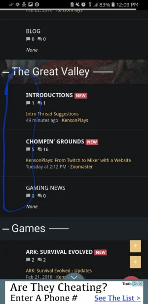
Your node icons need to be fixed. Right now you can't see them. I like the forum names, they suit the overall theme of the community. I would make an introduction forum under "The Great Valley" category, so your members can introduce themselves. This helps new users get oriented with the community and make them feel welcomed. Also, I would remove the entertainment category and make one forum called entertainment under the "The Great Valley" category. I think you should add a general gaming forum under the "Games" category as well, so your members can discuss games other than what the forum is focused on.

On your rules page I would get rid of the fancy headers:
NoSpam.png


They're very distracting and in my opinion, more simple headers (plain text) will work better.

That's all the feedback I have. I think you have a good start.
I have no other version of the logo, so that's unchangeable. I could try something with the background, although they were both custom made for me.

Node Icons? On the boards themselves, or the navigation menu (both)?

I will look into a more unique name for the intro board.

Let me try a different header style when I get home later this afternoon.

Node icons are forum icons.
Screenshot_20180301-120926_Chrome.webp

Also you have way too many ads on mobile. When I went to your site on my phone, I counted 5 ads. There was a full screen ad that I had to close to even see the website, an ad that scrolls with you on the bottom or top, one in the header, one in the footer, and a huge list of ads at the very bottom below of footer. Not trying to be negative or anything, but that's simply ridiculous. This is the reason ad blocker was developed.

I guarantee that a user coming to your site on mobile will leave because of all those ads. And honestly, you probably shouldn't even have ads right now. I don't think you have enough traffic to make the ads worthwhile. And trust me, the negative impact that ads will have on new users is far greater than any money you can make from the ads at this moment.

Its much better to introduce ads when your user base and traffic is much higher. When/if that happens, you should follow the acceptable ads guidelines.
 
Last edited:
Node icons are forum icons.
View attachment 170169

Also you have way too many ads on mobile. When I went to your site on my phone, I counted 5 ads. There was a full screen ad that I had to close to even see the website, an ad that scrolls with you on the bottom or top, one in the header, one in the footer, and a huge list of ads at the very bottom below of footer. Not trying to be negative or anything, but that's simply ridiculous. This is the reason ad blocker was developed.

I guarantee that a user coming to your site on mobile will leave because of all those ads. And honestly, you probably shouldn't even have ads right now. I don't think you have enough traffic to make the ads worthwhile. And trust me, the negative impact that ads will have on new users is far greater than any money you can make from the ads at this moment.

Its much better to introduce ads when your user base and traffic is much higher. When/if that happens, you should follow the acceptable ads guidelines.
Those ads weren't specifically placed by me, I just used the Adsense "Auto Ads." Blame Google? lol.

I will need to see about adding some custom icons for the forums. Not sure exactly how though.

EDIT: I removed the "Auto" one and just put one on thread view, below all messages only. I can't get any addons unless I can afford them, especially since I've been unemployed for 4-5 years.

Having one on the main page isn't too bad either. Also I would add a blend mode to the background, which will help with contrast been the logo and background a little bit. It will also make your background appear more bright and vivid.

Just add this to extra.css
Code:
background-color: rgba(255,255,255,0.5);
background-blend-mode: hard-light;
 
Made a slight tweak to that CSS.

Still separated, but less 'washed out' from my POV.

I'll consider one on the homepage, but not sure if on the top or bottom. I don't want to be too annoying, but my channel's been around since 2014, along with some of my regulars, most of them know I don't work at all, so the only way to add onto the site is via ads, but since I don't meet YT's new requirements for ads, I don't get em on YT.

EDIT: How does one add icons to each board (node)? I'm using the paid theme Tactical if that makes a difference.

Tactical should already have default node icons. Since you don't have them, I would open up a support ticket at Themehouse and ask why.

If you want to add a node icon to each forum, you can do it with ThemeHouse's Node Add-on which comes included with all their 2.x themes. You can download it from their customer area. Look at their documentation to see how.
 
1520018264797.webp

Yea, I'm sure. Ticket created, we'll have to see what the response is.

EDIT: They had to add it in, something was off on their end.
 
Last edited:
I haven’t read all the suggestions above so apologies if repeat:
- navigation: consider consolidating info, faq, and about. Less is more
- your front page has 4 or so “share page” with social media widgets. Are all of these needed?
- I don’t know why XF set things up this way, but the share this page widget wraps the last icon when viewing on a standard mobile phone. Even on this view on xf, the chain link icon (copy url) wraps. You might consider removing one or more of the less essential icons; there’s a setting for this.

I'll see what I can do later tonight.

I personally would rather keep About, Info, and FAQ separate. That way it won't get super long in the future. At least FAQ & About/Info separate, possibly.

It looks like I have fixed the duplicate social icons. They exist just at the bottom of the footer now.
 
I have returned to making a forum community. Still Family-Friendly focus (with a "PG" type Censor being tweaked over time).

I am using a simpler theme, Royal, instead of Tactical (which had huge nav items).

I'd love some new constructive critiques. Not looking for real deconstructive at this point, as I personally have a hard time accepting them if they're written a certain way (like in a down putting way). If you can be deconstructive without being negative, then I am fine with that kind of feedback as well.

The URL is in my signature, and here: Jurassic Kingdoms
 
I quite like it. It looks kind of retro. Don't give up, keep pushing and have no limits! Go as far as you can with it, you will do just great. Keep it up!
 
I quite like it. It looks kind of retro. Don't give up, keep pushing and have no limits! Go as far as you can with it, you will do just great. Keep it up!
Thanks for the kind words! I am letting my community know that some of the former Discord channels are being moved to the Forums to try to help promote activity on the forums. :)
 
Top Bottom