ratix_gunz
Active member
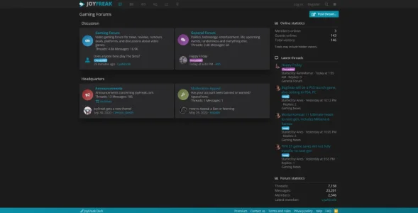
Very nice theme, what did you modify to navigate with the tooltip?


Thank you <3Love the clean look of the dark theme. Good work!


Product page? Can you link me? I’ll take a look.I like your website but there is too many adds averywhere, untill 4 for a product page.

Just trying different approach. I think it's on trend now to have things like a news feed than a category list/forum list.
Can you check now?Title is blurry with light theme
View attachment 242796
and the scroll bar maybe prettier with your personalization but totally unusable.
Otherwise, good job, the general rendering is very good
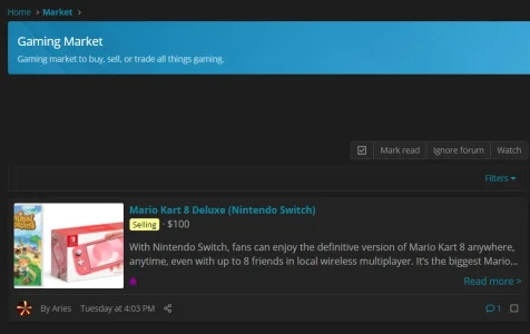
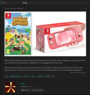
They're not really articles, they are threads and the content is dependant on the author. It's like a thread list but a preview of the actual posts. I agree that the frontpage needs some visual flare but some posts do offer that with embedded media/images. I watched XenForo's insights episode 1 which suggested to use the latest posts as a the homepage but felt an article view is a lot better visually so went with that.The articles themselves need more cowbell. Some visual media to decorate them. Empty blocks of text are not attractive for a front page. Other than that, everything is looking sweet!
We use essential cookies to make this site work, and optional cookies to enhance your experience.