Flat Awesome - PixelExit.com [Deleted]

If I enable "Host Font Awesome Locally?" that member card icon disappear :/

Interesting, can't reproduce it. Local/CDN works fine me.

Shoutbox send button mis aligned?
View attachment 77719

Pagination design:
View attachment 77720

First one I think something like this fixes it(it was an issue on another style)
Code:
#taigachat_sidebar #taigachat_send {
height: 32px !important;
padding: 0 !important;
}

Probably needs to just increase the width: style properties -> pagenav/link -> PageNav Link Width

I'll increase it for next release.
 
  • Like
Reactions: rdn
First one I think something like this fixes it(it was an issue on another style)
Code:
#taigachat_sidebar #taigachat_send {
height: 32px !important;
padding: 0 !important;
}
padding: 0 !important; is not necessary Thanks!
 
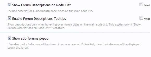
Why did you disable this by default?
View attachment 77721

Much better if it's enabled ;)


Add:
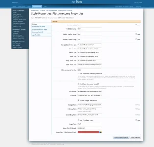
How come I have different Style Properties compare to the one here: http://xenforo.com/community/attachments/fa5-png.77692/
View attachment 77723


Add:
Alerts don't have close button also.
View attachment 77726

Add:
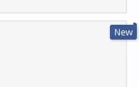
New indicator placement
View attachment 77724

Stack Alerts do not have a close button by default, I'm assuming that is what you screenshot is.

As for the properties, for some reason they end up ordered different when exporting/importing. Still trying to track down exactly why it does that. Also does it on our framework.

http://xenforo.com/community/threads/style-property-ordering.78170/
 
  • Like
Reactions: rdn
Nice themes. Is this theme easy to config? I would like to use this theme as a "base theme" for any modification.
 
Nice themes. Is this theme easy to config? I would like to use this theme as a "base theme" for any modification.


Ya :) it's really close to the default style in the sense that nothing major has been added.

You can easy adjust the font size, border radius with a few simple properties. The colors are pretty basic too so it keeps them easy to change.

The only real downside to this style is the amount of edits in the templates that were done. This was done simply to remove any images from loading and not just overwriting them using background-image: none.

Russ when you say that images do not load, which ones do you mean? The reason I ask is because this is a great skin for mobile.
 
Russ when you say that images do not load, which ones do you mean? The reason I ask is because this is a great skin for mobile.

Things like node-sprite.png, twitter-bird.png, gplus.png, logo.png, category-23px-light.png(this one loads on a lot of different places),close.png, xenforo-ui-sprite.png(which covers things like the rss icon, new post indicator, in unread alert star, dropdown/up arrows, search icon in mobile and a few other things).

In reality you're not saving a meg of loading time with this style, but a lot of work has gone into reducing the request and getting rid of the images.
 
  • Like
Reactions: rdn
Things like node-sprite.png, twitter-bird.png, gplus.png, logo.png, category-23px-light.png(this one loads on a lot of different places),close.png, xenforo-ui-sprite.png(which covers things like the rss icon, new post indicator, in unread alert star, dropdown/up arrows, search icon in mobile and a few other things).

In reality you're not saving a meg of loading time with this style, but a lot of work has gone into reducing the request and getting rid of the images.
I have been looking for a skin like this for a while now. I have large everything on my default skins but wanted a nice light skin for mobile browsing. This is it! I installed it and and changed some colors but I didnt like it. I put it back to what you had. You had it right the first time. Also, you made it easy for a template dummy like me to change stuff.

I probably have another dumb question for but here it goes, how can i hide the social icons?

Open ad_header

Remove all but the first line :)
 
Ya :) it's really close to the default style in the sense that nothing major has been added.

You can easy adjust the font size, border radius with a few simple properties. The colors are pretty basic too so it keeps them easy to change.

The only real downside to this style is the amount of edits in the templates that were done. This was done simply to remove any images from loading and not just overwriting them using background-image: none.
No problem for me.

How about addon support? Like XenPorta and Extra Portal?
 
No problem for me.

How about addon support? Like XenPorta and Extra Portal?

There's no guarantee it'll work with every single add-on but with that said it's kept as close to XF standards as possible so if the plugin is coded competently, the style will work fine on it. If there's any quirks you can always ask, we help users with plugins on our premium styles for free as well.

With that said I had xenporta installed for a client and flat awesome looked fine.
 
  • Like
Reactions: rdn
Top Bottom