You are using an out of date browser. It may not display this or other websites correctly.
You should upgrade or use an alternative browser.
You should upgrade or use an alternative browser.
Core - PixelExit.com [Deleted]
- Thread starter Russ
- Start date
Thanks, so I will need to reinstall the style completely to get this working properly again? If so - when you are back on your desktop, can you let me know the order in which I need to do things - remove style in XF, copy and overwrite files, install style as new style?Ideally install Core as a default style, then create a new style which is a child style underneath it. Make all your changes on the child style.
If not, how else can I reset to the styles default (not XF default style's default - so confusing).
I have no idea why XF was designed this way!
EDIT: Is there any way to allow XenPorta to break out of the content container on the portal? I.e. so the background shows in between the various posts, blocks etc. It works on Flexile but doesn't with Core, for some reason.
EDIT2: Is there a way to hide the Search box in the header area? Sorry for the all the questions!
")
Attachments
Russ
Well-known member
Hey Greg, you should be fine to leave the uploaded folders alone for right now. To re-install the style simply remove it under the Appearances, then import the core XML provided. After that just create a child style underneath that.
Also let me look at the remove from content container!
As for your screenshot, I believe it's actually an update with post ratings that came with 1.1.4.
Also let me look at the remove from content container!
As for your screenshot, I believe it's actually an update with post ratings that came with 1.1.4.
Heh, you beat me to it. I must have edited the Post Ratings part out after you replied. The error has nothing to do with your style.Hey Greg, you should be fine to leave the uploaded folders alone for right now. To re-install the style simply remove it under the Appearances, then import the core XML provided. After that just create a child style underneath that.
Also let me look at the remove from content container!
As for your screenshot, I believe it's actually an update with post ratings that came with 1.1.4.
Thanks for looking into the content container thing.
Looking good
www.HackSlashRepeat.com
EDIT: After some testing, turning the "Break out of Content Containers" option on in XenPorta DOES work, however it's almost like there's two containers, one inside another. Hard to explain, it does something, but it doesn't have the same effect as it does with Flexile. Basically I'm trying to minimise the amount of white in the style as it's burning my user's eyeballs out

Russ
Well-known member
EDIT: After some testing, turning the "Break out of Content Containers" option on in XenPorta DOES work, however it's almost like there's two containers, one inside another. Hard to explain, it does something, but it doesn't have the same effect as it does with Flexile. Basically I'm trying to minimise the amount of white in the style as it's burning my user's eyeballs out
Looking really good Greg, digging the background.
As for the break out... it should work as defaulted, one thing you go do is reduce the padding on the content area I suppose.
Appearance -> Style Properties -> General - Content
You could also make the background color on that slighly darker, just a bit
Hmmm, that's not really giving the effect I was looking for. Basically when Break out of Content Containers is enabled, it should show parts of the background between blocks/page elements. It worked fine on Flexile, I just don't know why it's not working with this theme. I think it's really the only way to subdue all the white.Looking really good Greg, digging the background.
As for the break out... it should work as defaulted, one thing you go do is reduce the padding on the content area I suppose.
Appearance -> Style Properties -> General - Content
You could also make the background color on that slighly darker, just a bit
Russ
Well-known member
Hmmm, that's not really giving the effect I was looking for. Basically when Break out of Content Containers is enabled, it should show parts of the background between blocks/page elements. It worked fine on Flexile, I just don't know why it's not working with this theme. I think it's really the only way to subdue all the white.
From my understanding all break out of container does it remove the usually page container which takes out the title bar and the breadcrumb. Sounds like what you're referring to would be a transparent background which isn't the case for that option.
speedway
Well-known member
Bought Core today, pretty happy with it. I have been customising it a little as a I go along but need help with a few things. See the image below:

In order:
1. The blue secondary nav line - I want that to go the screen width. I have changed the CSS definition to 100% width but as you see it is not. (have posted re this this over at pixelEdit too)
2. I want to move the logo up closer to the secondary nav bar. Can't figure out where that is.
3. Remove the blue on top of the content (above the breadcrumb)
4. Also want to add a few pixels space between the content box and the blue header.
5. Centre the banner vertically in the space between the breadcrumb and the content.
Any help appreciated.
Cheers
Russ
Well-known member
Okie dokie, have worked out most of this myself, was probably better that no-one answered my questions. Still a couple to get my head around but so far so good.
Haha apologies, been a tad bit busy today, didn't see this one. For quicker support(usually) post over on our forums: http://pixelexit.com/community/ we just switched hosting so it should be back 100%.
Let me know what other ones you need help with I'll be on for a bit.
speedway
Well-known member
Hi Russ
'Tis cool, I have learned alot from figuring things out myself. Have made some stuff ups along the way but hey, thats the learning process huh?
The remaining 2 that have me stumped at the moment are the logo area height and the banner alignment. With the site logo I basically am after about 5-10px top and bottom. With the banner (currently residing in ad_above_top_breadcrumb (via the Rotating Ads plugin)) I would like it with less space (margin? padding?) on the top and a little more on the bottom.
Cheers
Russ
Well-known member
Do you have a dev board I can take a look at? You can PC me the link too if you want, it'll be much quicker with the edits.Hi Russ
'Tis cool, I have learned alot from figuring things out myself. Have made some stuff ups along the way but hey, thats the learning process huh?
The remaining 2 that have me stumped at the moment are the logo area height and the banner alignment. With the site logo I basically am after about 5-10px top and bottom. With the banner (currently residing in ad_above_top_breadcrumb (via the Rotating Ads plugin)) I would like it with less space (margin? padding?) on the top and a little more on the bottom.
Cheers
Quick styling question - I've increased bottom-border under the headings from 1px to 4px for the main areas of the site (under categories etc) however I can't seem to find the code to increase the same for the blocks in the sidebar?
Any ideas?
http://www.hackslashrepeat.com/forum/
Any ideas?
http://www.hackslashrepeat.com/forum/
Russ
Well-known member
Quick styling question - I've increased bottom-border under the headings from 1px to 4px for the main areas of the site (under categories etc) however I can't seem to find the code to increase the same for the blocks in the sidebar?
Any ideas?
http://www.hackslashrepeat.com/forum/
Here you go: Style Props -> Sidebar -> Block Heading

Attachments
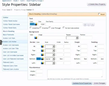
Cheers mate, I seem to have a bit of a colour mis-match though, the sidebar block heading bottom-border is set to 3px, @primaryLight but there is still a very light blue strip above it (1px it looks to be). From what I can gather, it isn't just a 4px bottom-border but 1px + 3px bottom-border?
Probably easier to just have another look at my site
Any ideas?EDIT: Silly question, but if I make changes in Style Properties (should as borders etc), are those changes retained if/when I update the style to a newer version? Or should I be using TMS to hard-code the changes in?
Russ
Well-known member
Cheers mate, I seem to have a bit of a colour mis-match though, the sidebar block heading bottom-border is set to 3px, @primaryLight but there is still a very light blue strip above it (1px it looks to be). From what I can gather, it isn't just a 4px bottom-border but 1px + 3px bottom-border?
Probably easier to just have another look at my site
EDIT: Silly question, but if I make changes in Style Properties (should as borders etc), are those changes retained if/when I update the style to a newer version? Or should I be using TMS to hard-code the changes in?
Ya it's actually somewhat of a bug on my end... I noticed that border when I went to grab the fix for you.
In regards to being overwritten, best bet would be to create a new child theme under neath core and start editing that. All style properties/templates you edit would retain even on an upgrade however if I've modified a template all you'll need to do is go back in and re-apply your edits on top of mine.
I'm taking off for the weekend but if you have any further questions you need answered hit up pixelexit.com/community Steve can help out over there when he spots it. Thanks!
No worries, I've made a child theme alreadyYa it's actually somewhat of a bug on my end... I noticed that border when I went to grab the fix for you.
In regards to being overwritten, best bet would be to create a new child theme under neath core and start editing that. All style properties/templates you edit would retain even on an upgrade however if I've modified a template all you'll need to do is go back in and re-apply your edits on top of mine.
I'm taking off for the weekend but if you have any further questions you need answered hit up pixelexit.com/community Steve can help out over there when he spots it. Thanks!
Enjoy your break!
Jaxel
Well-known member
Just bought my second copy of this skin... will soon be launching: http://yokappa.com/
Similar threads
- Replies
- 19
- Views
- 2K